
Brief
A brand guide built from scratch for a photography platform that had been operating for fifteen years without one, which quietly losing brand coherence as a result.
Industry
Technology / Photography & Creative Community
Scope
Brand audit, visual system development, brand guidelines
My Role
Brand Strategist & Lead Designer
Deliverables
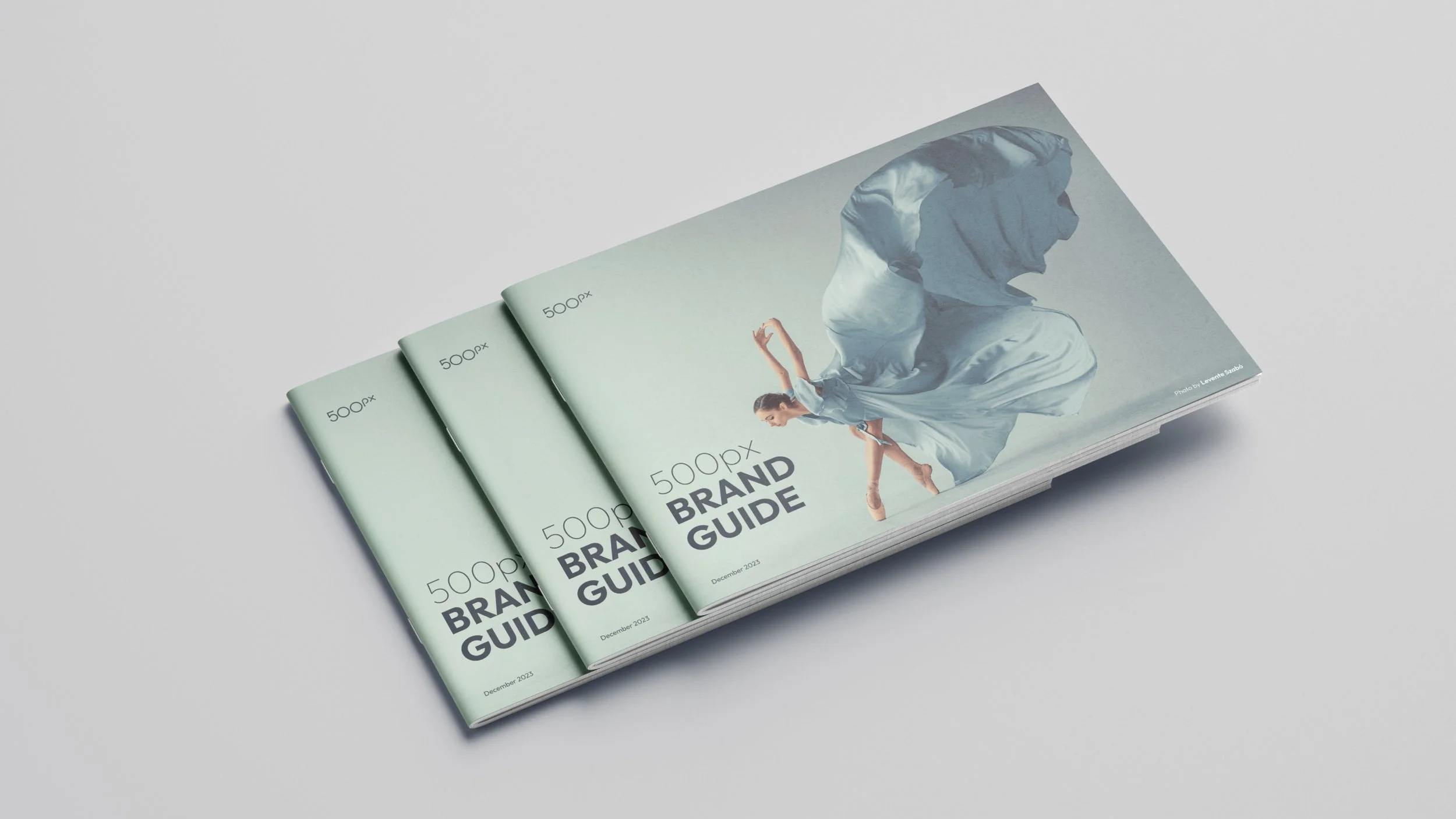
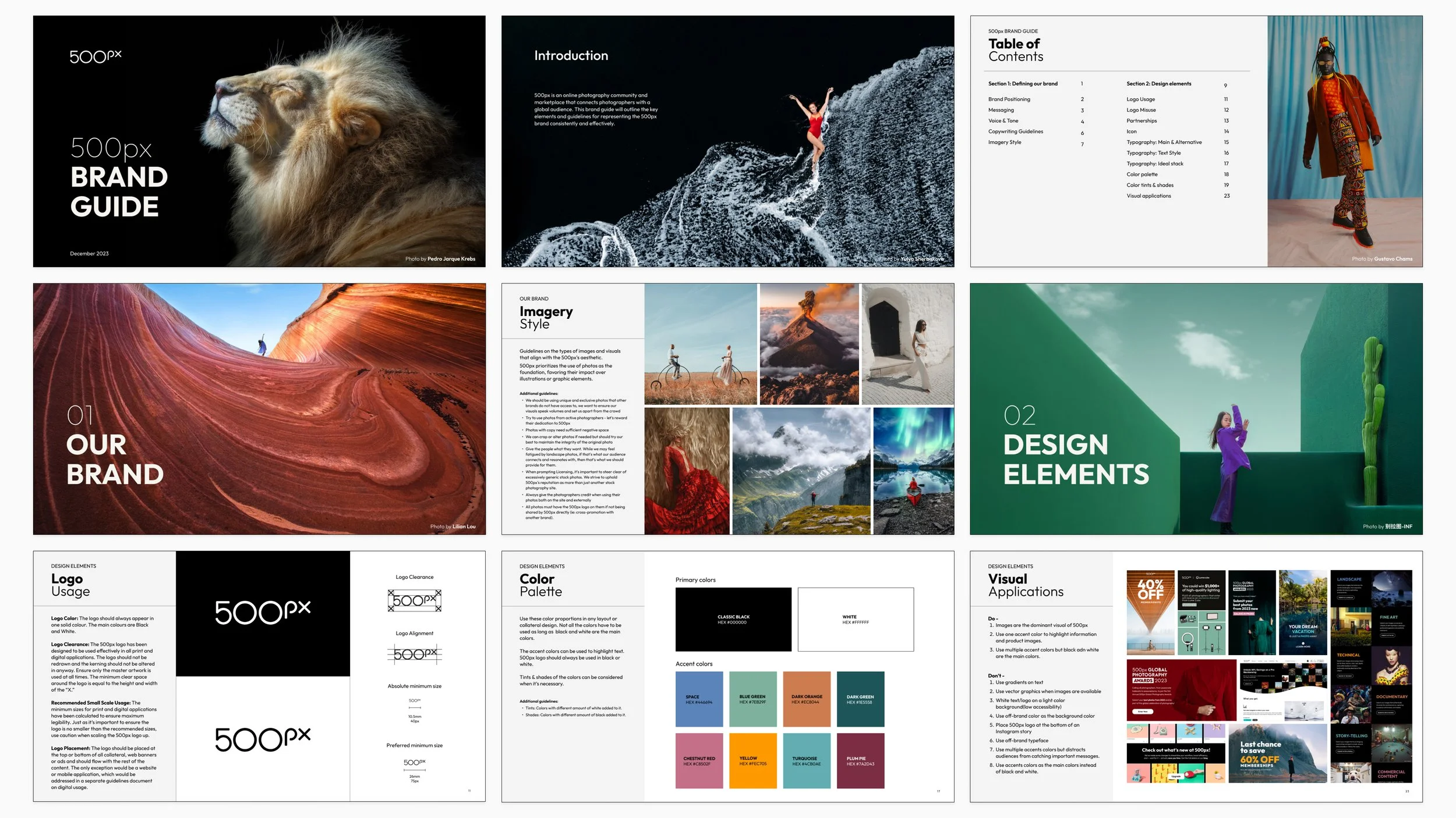
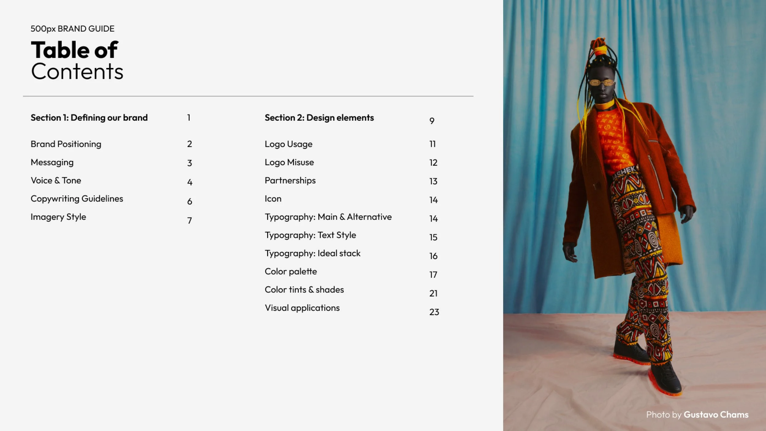
Full brand audit, 23-page brand guide covering logo usage, colour system, typography, iconography, image style, voice and tone
1
The situation
500px had been one of the world's leading photography platforms since 2009. Fifteen years of growth, product evolution, campaigns, and team changes, but through all of it, no single document that defined what the brand actually looked like, sounded like, or stood for, and most importantly — what was 500px’s story?
The surface problem was inconsistency: different teams making different visual decisions, no shared reference point, brand elements drifting across touchpoints. But the real problem was that, without a brand guide, 500px had no articulated story about itself. Every team was improvising, because no one had ever written down what the brand was.
I took the initiative to fix that.
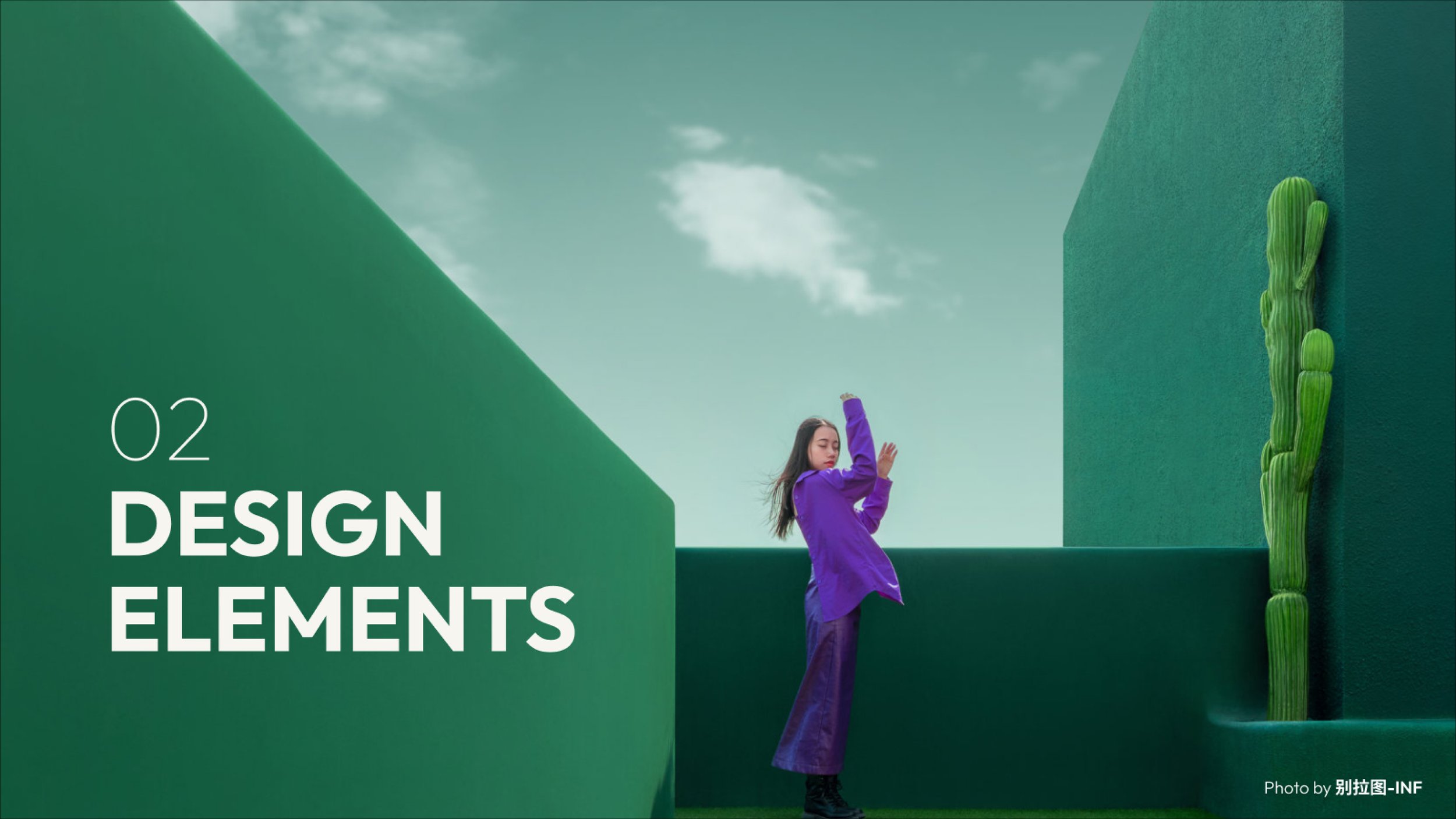
2
The real problem
A brand guide is usually described as a design document. Rules for logo usage, colour codes, type scales, but that framing misses the point.
What a brand guide actually does is make a decision: this is who we are, this is what we sound like, this is what we stand for; and everything we produce from here forward will reflect that. It's a narrative decision in design language.
500px's challenge was that the brand had a genuine story worth telling: a global community of serious photographers, a platform where craft was celebrated over virality, a belief that photography at its best is more than content. But that story wasn't being told consistently anywhere. The brand guide needed to be the document that named it and held it.
3
The process
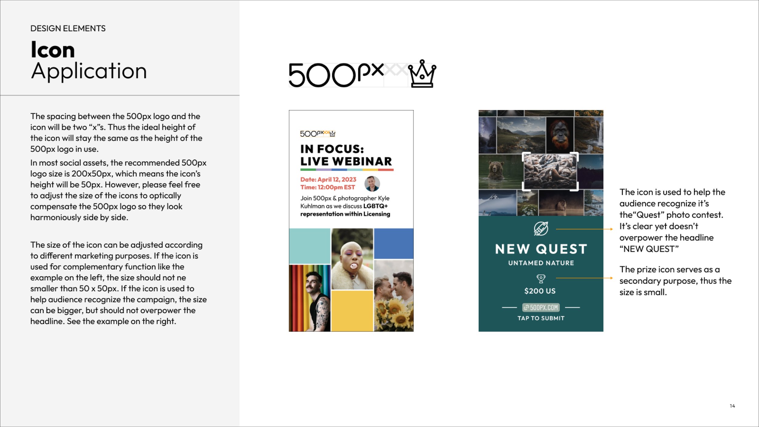
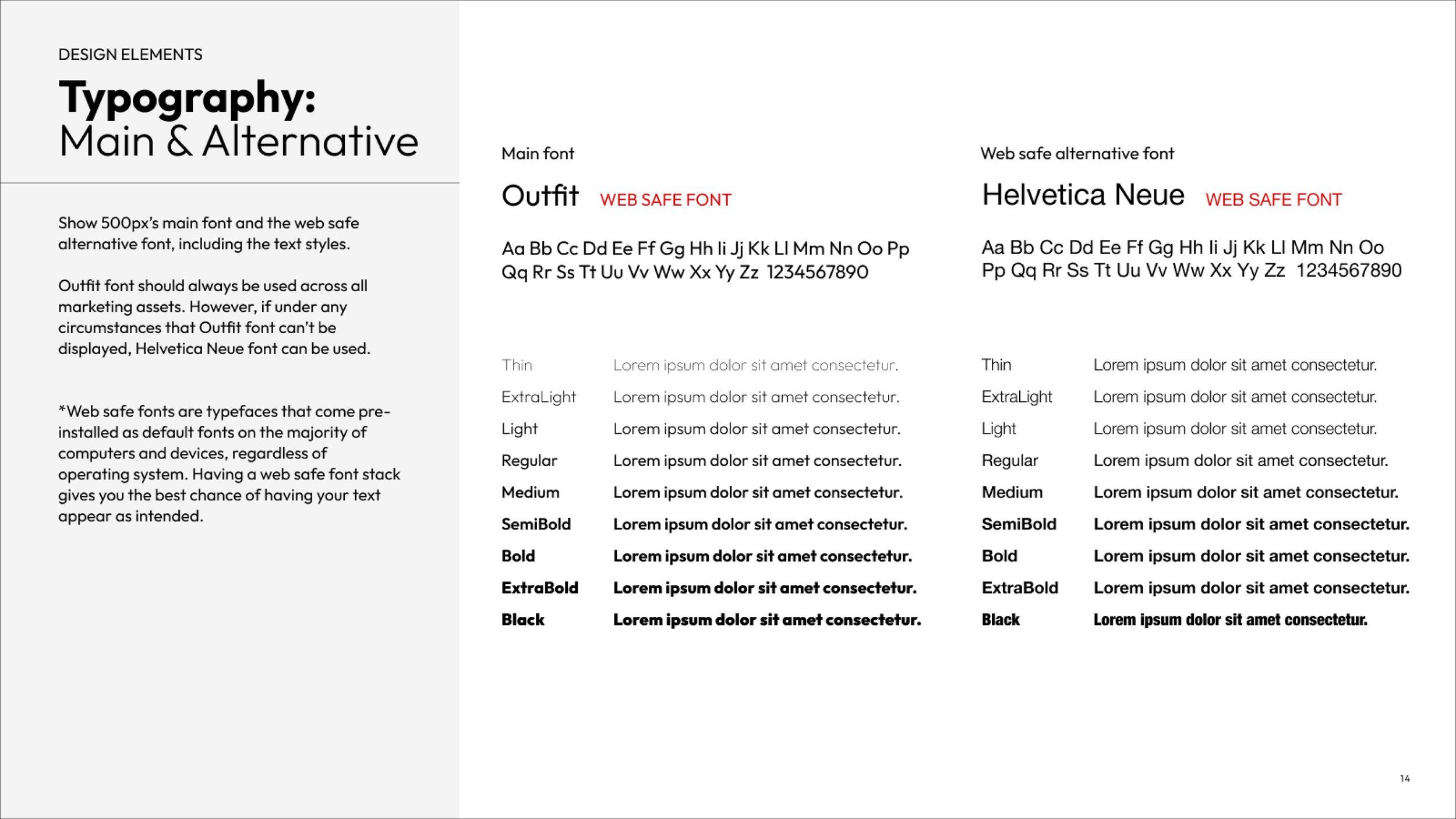
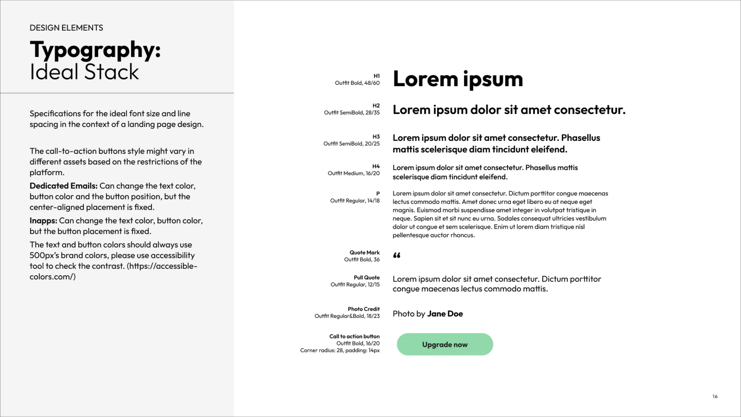
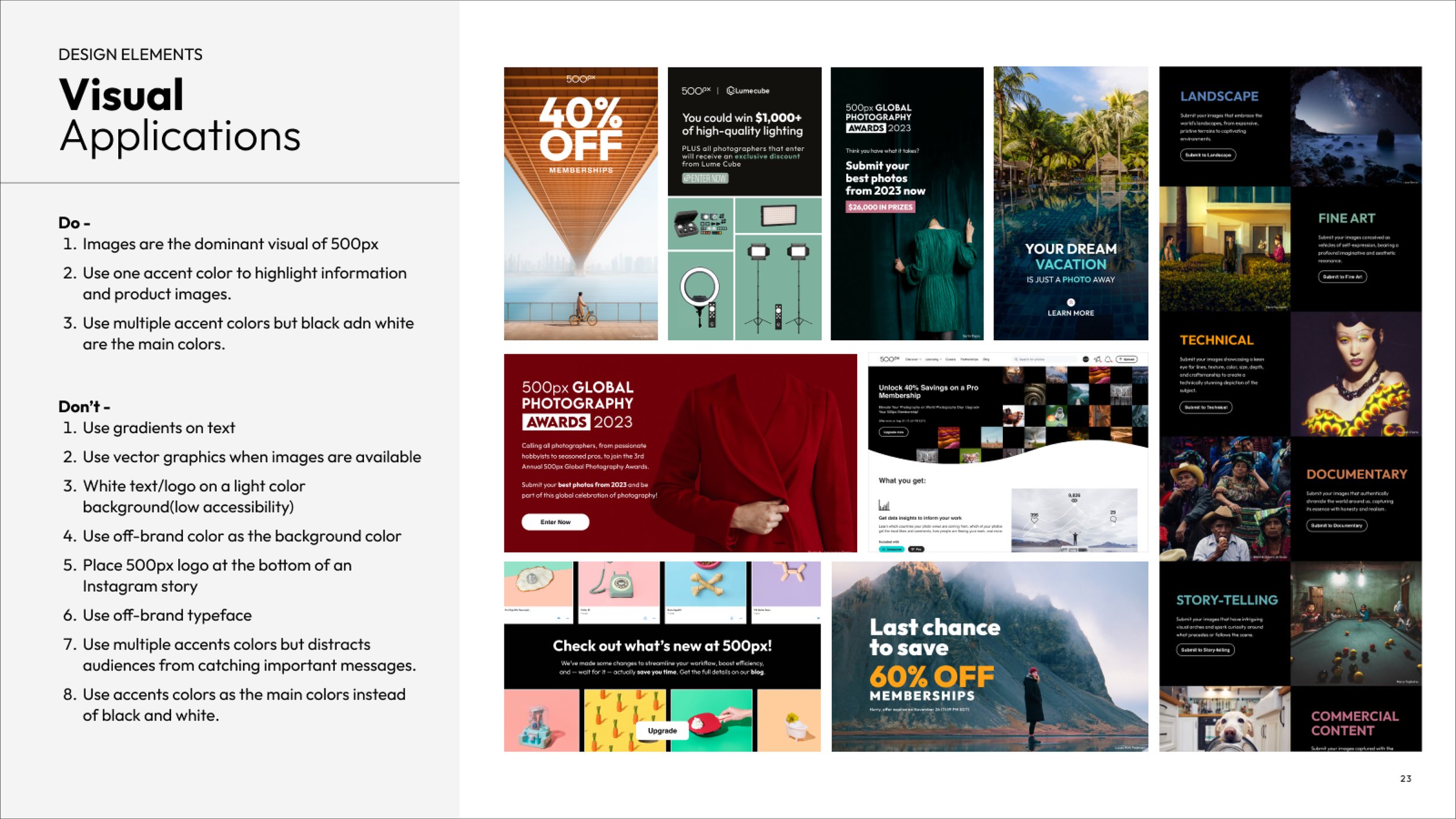
I started with an audit of 500px's existing visual assets across every touchpoint: product UI, marketing materials, social, editorial, partner-facing documents. What I found was a brand that had strong bones (the core visual identity was solid), but no governing logic connecting the decisions. The logo was being used differently across contexts. The colour palette had drifted. Typography choices varied by team. The voice guidelines that existed were vague to the point of being unusable.
The audit gave me two things: a clear picture of what was working and worth codifying, and a clear picture of what needed to be rebuilt before we could document it.
From there, I worked with marketing, product, and leadership to confirm what the brand actually needed to do across real-world use cases (not just in theory). The goal wasn't to produce a beautiful document that sat in a shared drive. It was to produce something teams would actually open and use.
4
A detail worth noting
The voice and tone section was the most underdeveloped part of 500px's brand before this project — and in some ways the most important. A photography platform is speaking to artists. The gap between language that respects that and language that condescends to it is the difference between a community and a product. Getting the voice right was a strategy, not just a copywriting task.
5
The outcome
The 23-page brand guide became the single source of truth for all 500px design and communication. It reduced ambiguity across teams, brought coherence to a brand that had been quietly fragmenting for years, and gave the company a clear, shared language for who they are and how they show up.
More importantly, it gave the brand a document it could actually grow from. It shows: this is the story we're telling, and here's how to tell it consistently.