Brand Identity Design
Creative direction
Brand strategy
Visual design
My Role
Creative director and brand designer
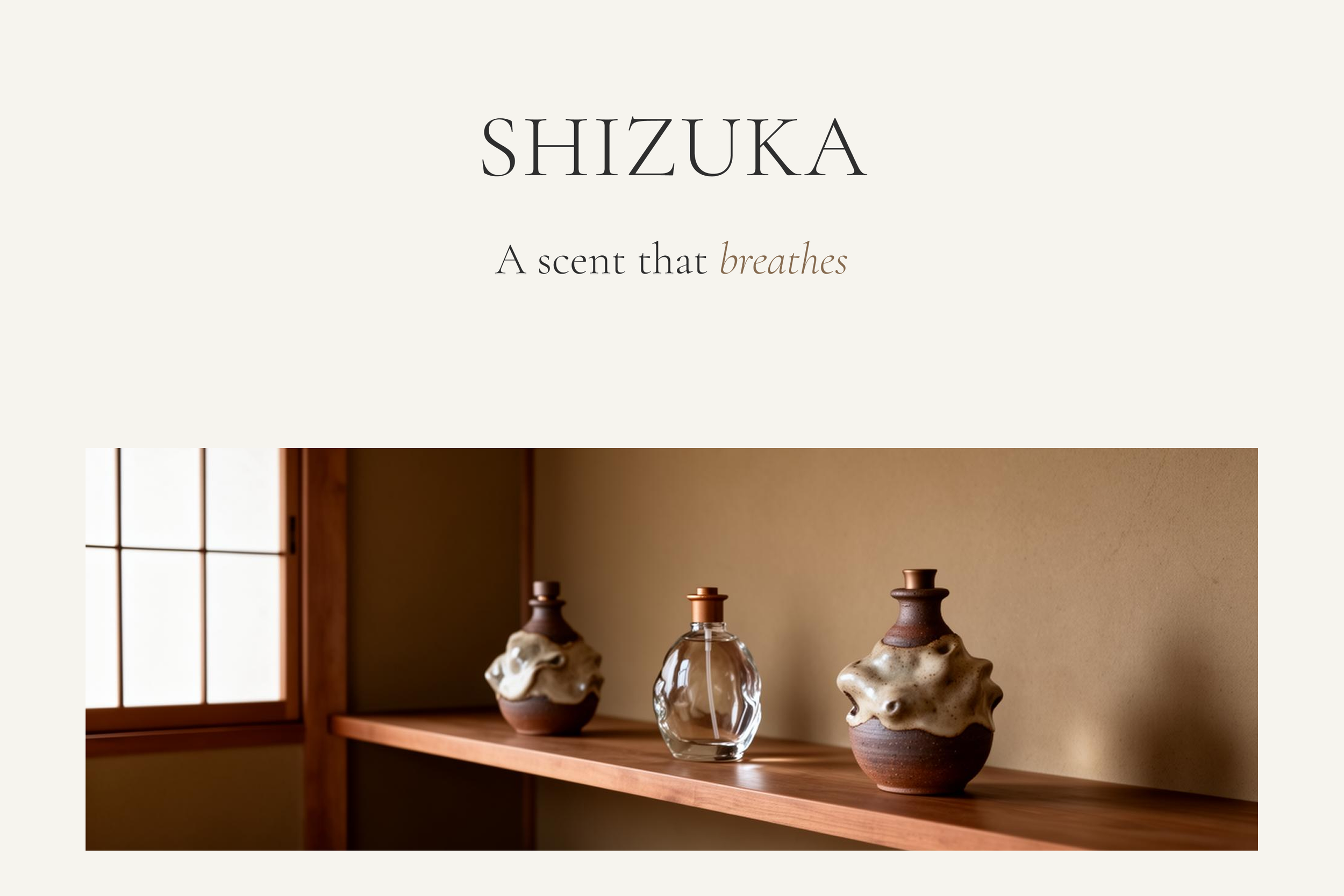
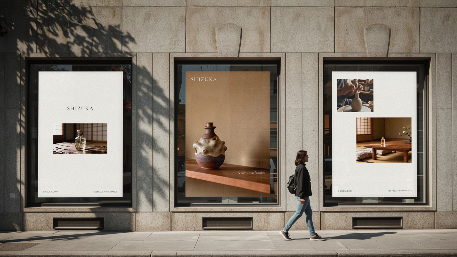
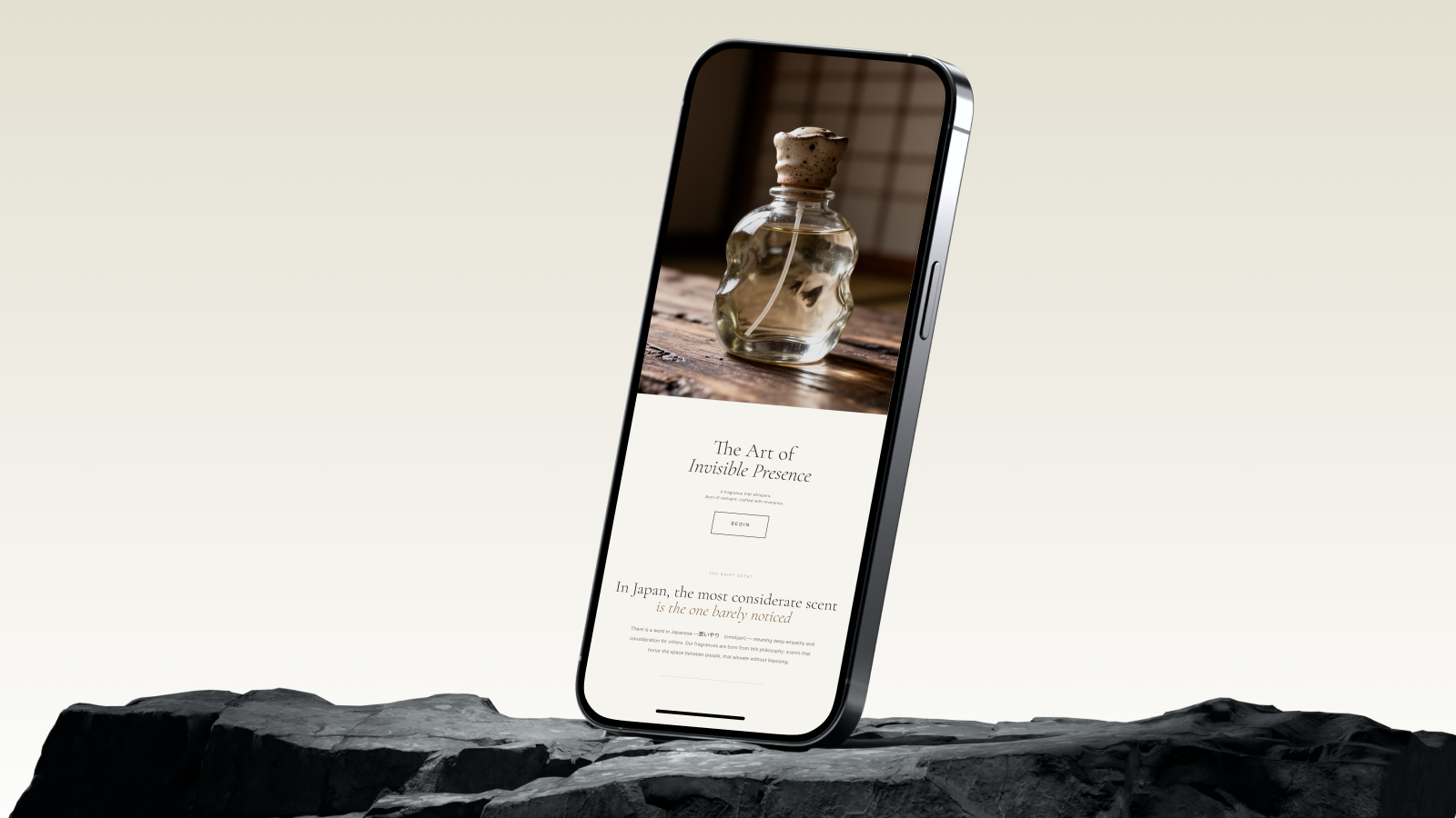
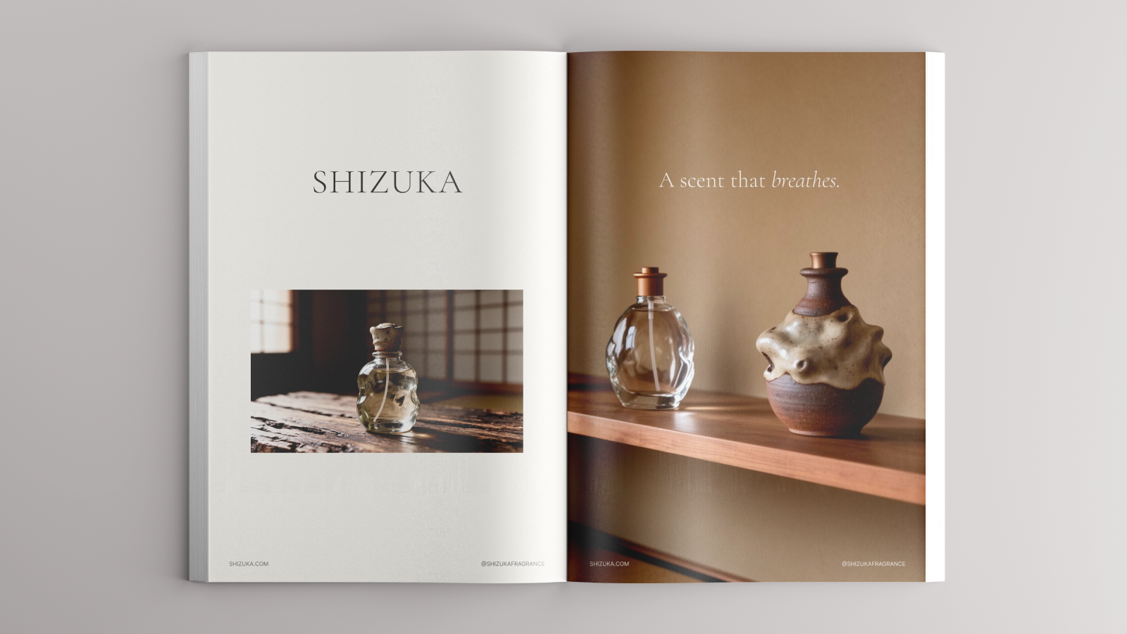
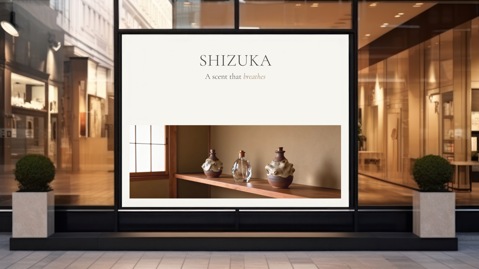
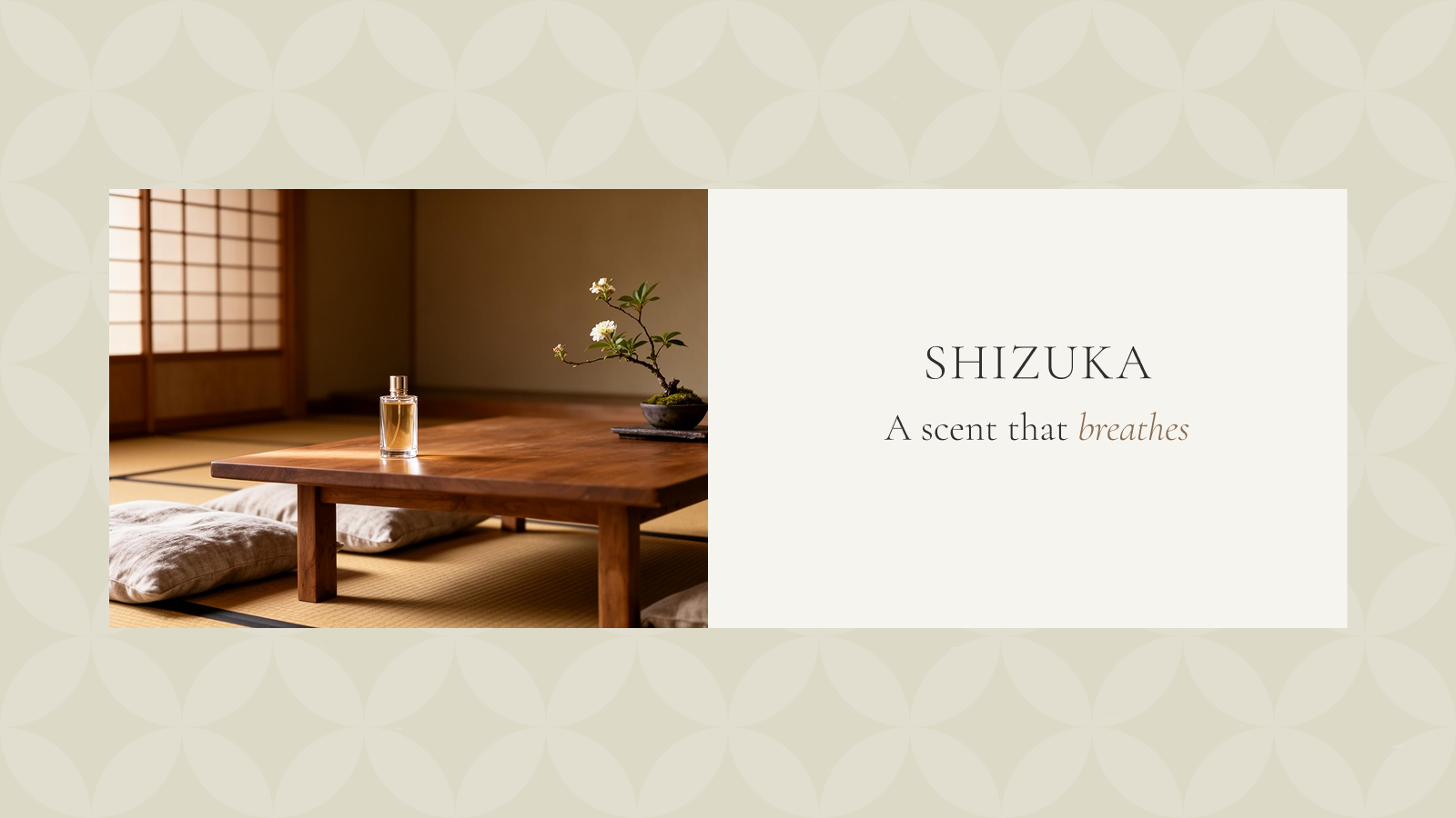
SHIZUKA: The Art of Invisible Presence
The architecture of calm
In a world that is increasingly loud, true luxury can only be found in silence. When SHIZUKA was conceived, the high-end fragrance market was saturated with "statement" scents. They are heavy, diffusive, and designed to dominate a room. For the discerning individual, whose life is already filled with influence and abundance, the ultimate sophistication is making a statement with the power of invisible presence.
SHIZUKA was born to fill a void in the lives of the global elite: the need for a scent that doesn't impose, but breathes. I looked to the Japanese philosophy of Omoiyari (思いやり), which means deep empathy and consideration for others, to redefine what a luxury fragrance could be. In Japan, the most considerate scent is the one barely noticed. It is an elevation of the space between people, not a bridge to be crossed.
Omoiyari in every breath
The inflection point for the brand was moving away from the concept of "perfume" entirely. For our target audience — individuals with an annual income of $500K+ who value privacy, serenity, and understated elegance; fragrance is not a tool for vanity, but a component of their environment.
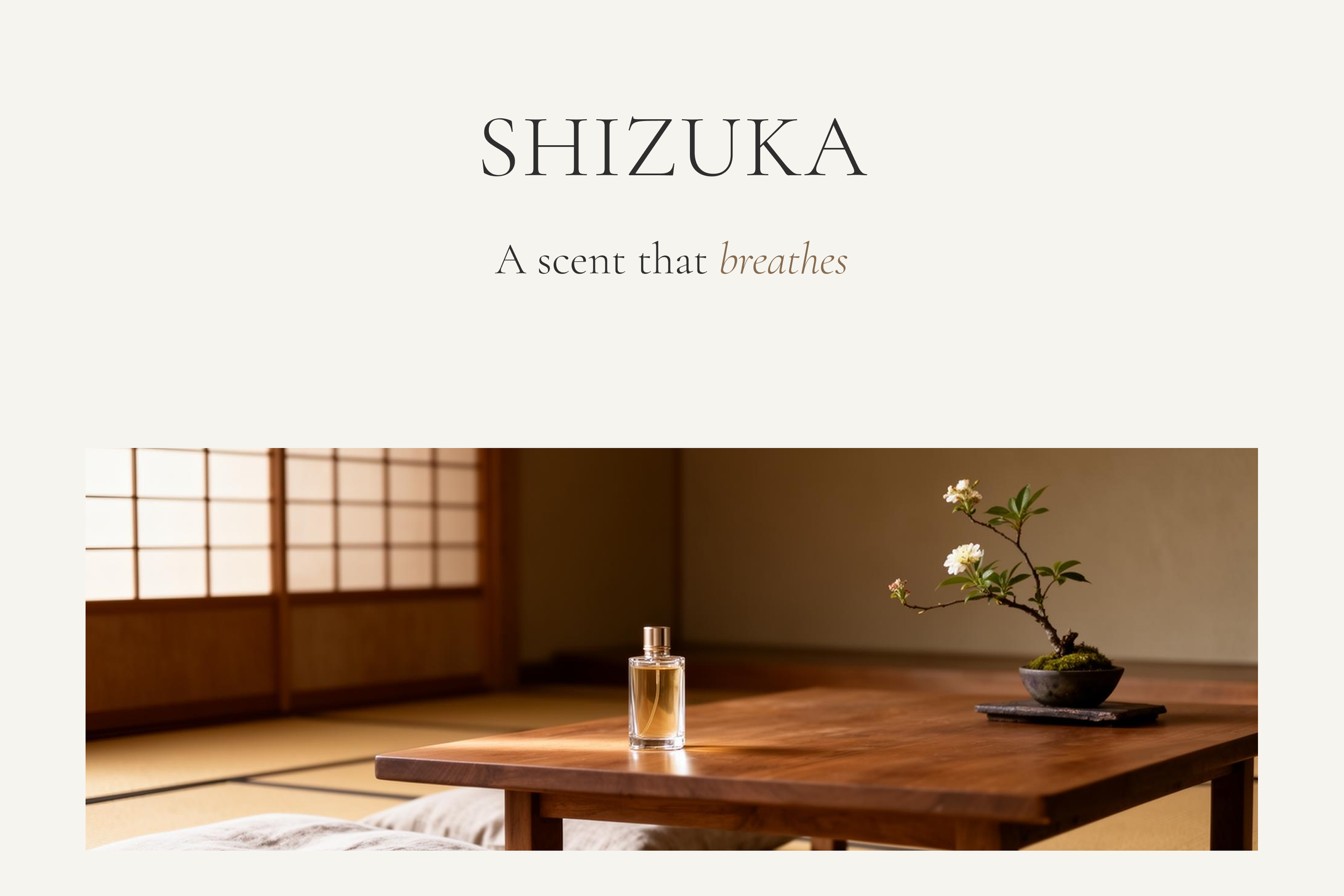
The insight was rooted in the sanctity of the home. The daily ritual of returning to one’s sanctuary should be a meditative transition. I realized that for this audience, luxury is the ability to control one's atmosphere. The creative North Star became "The scent that breathes." It reflects a fragrance that expands and contracts with the natural airflow of a room, honoring the Japanese aesthetic of "polite distance" while transforming a living space into a restorative retreat.
A brand built on material harmony
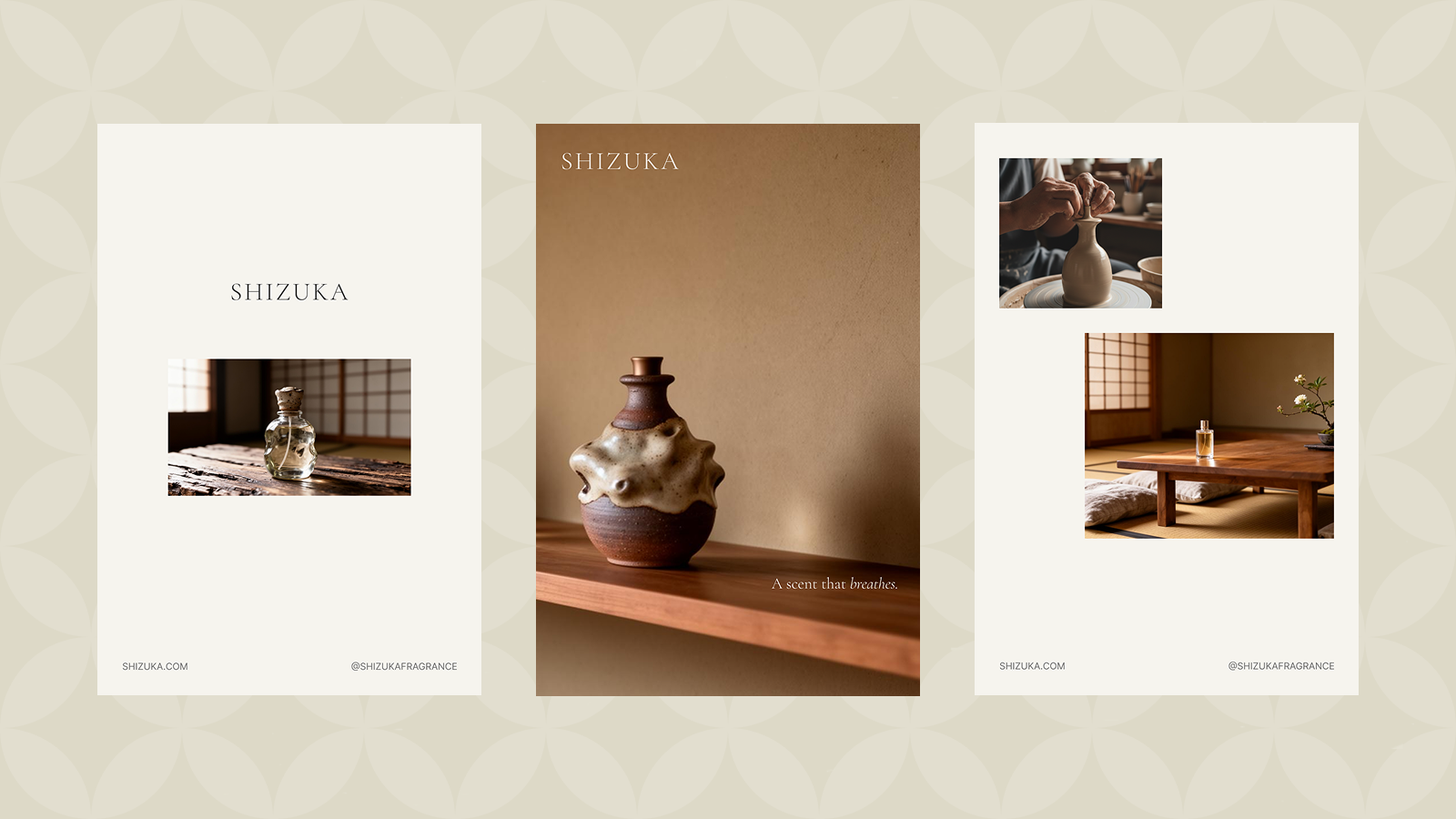
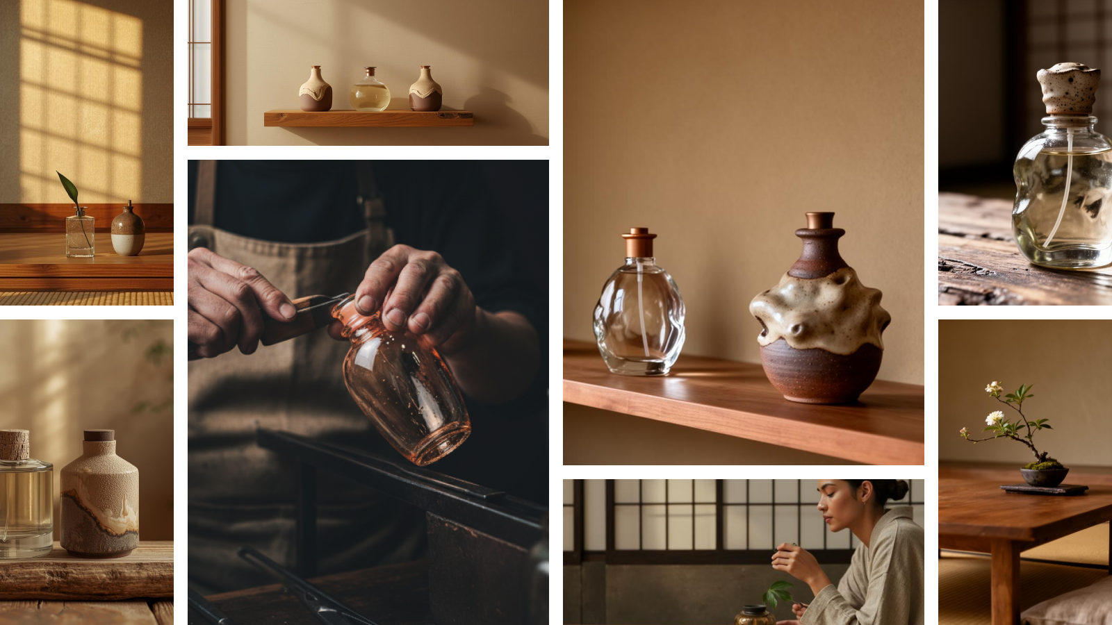
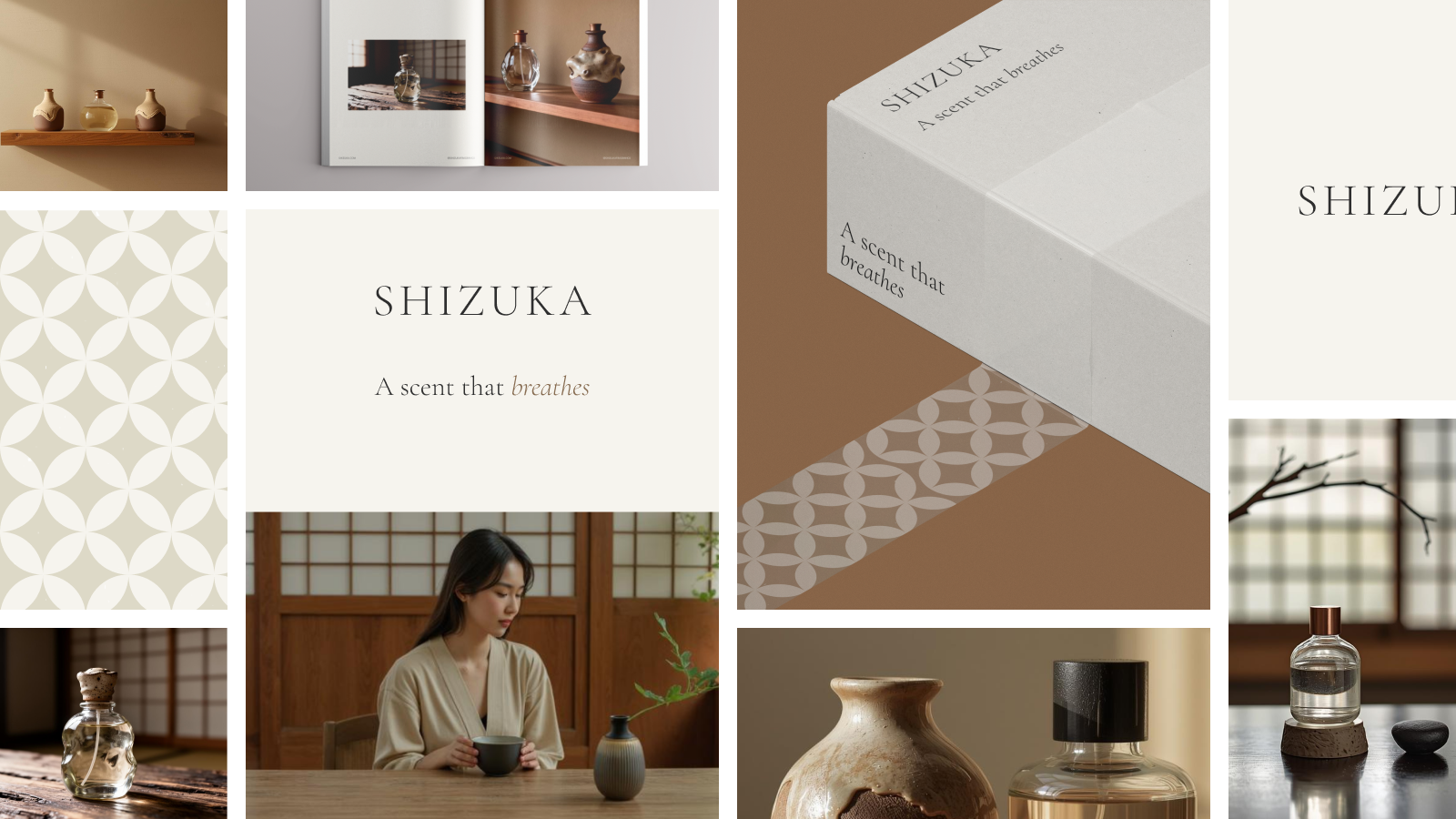
At the heart of SHIZUKA’s identity is the physical union of two ancient Japanese crafts: hand-blown glass and kiln-fired pottery. This duality represents the brand’s core tension—the clarity of the scent meeting the earthiness of its origins.
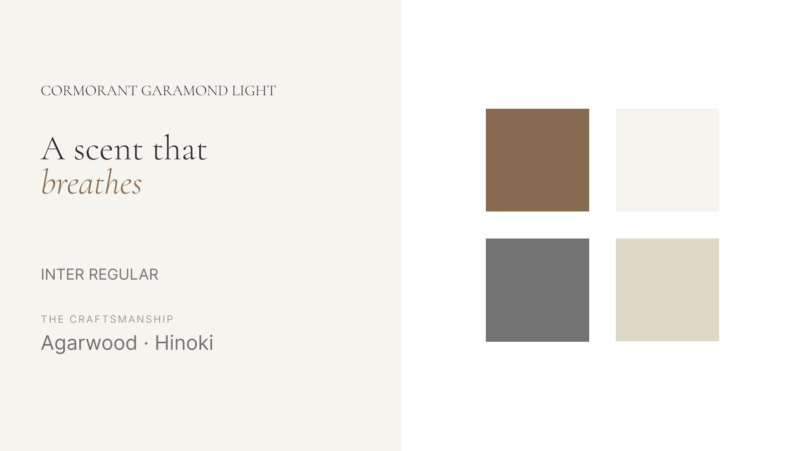
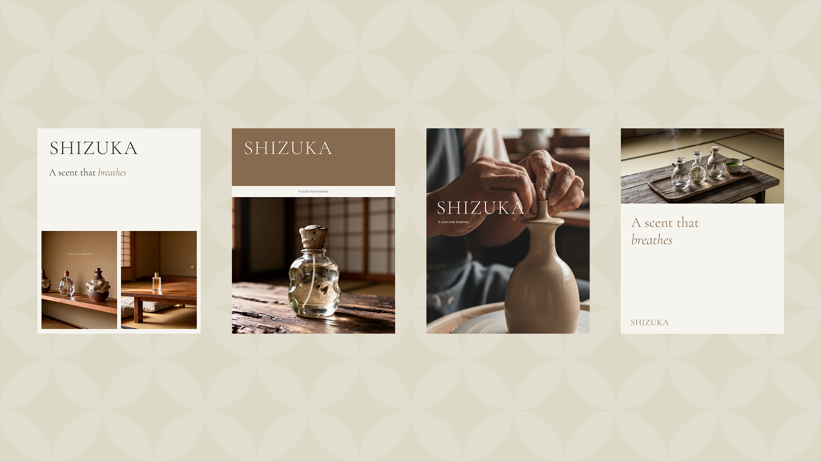
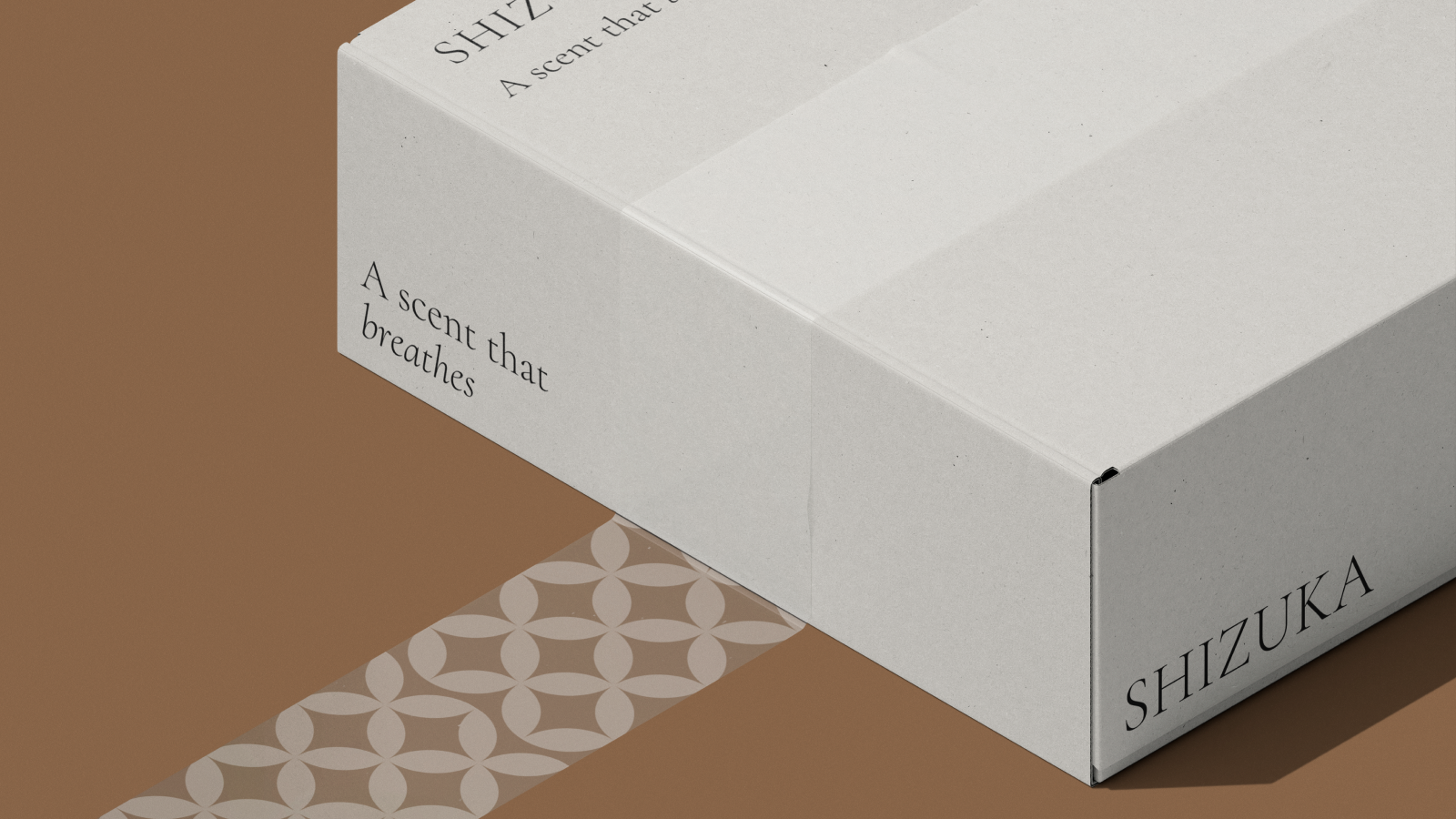
I developed a visual system where the product functions as a "functional sculpture." The bottle is designed to be a piece of home decor, meant to sit on a Hinoki wood shelf or a stone ledge where the light catches the glass. The branding is intentionally stripped back; the logo, set in a delicate Cormorant Garamond, is the only mark on the packaging, not on the bottles. It is an exercise in restraint.
The olfactory identity is equally disciplined, utilizing raw, organic materials like Agarwood and ceremonial tea. Every scent is accompanied by a unique Haiku written by the founder, bridging the gap between the sensory and the literary. It is a brand that treats a scent like a piece of architecture; it’s built to last, built to be lived in, and built to be felt rather than heard.
From product to atmosphere
Since its introduction, SHIZUKA has shifted the conversation from personal grooming to atmospheric design. It has given the ultra-high-net-worth consumer a new vocabulary for luxury; one that prioritizes the "soul" of a space over the "status" of a label.
SHIZUKA doesn't just sell a fragrance; it sells a feeling of profound respect and tranquil presence. It is the brand for those who know that the most powerful thing you can do in a room is to take up the invisible presence.
Portfolio Note: Creative Execution
Brand Identity: Minimalist Serif Typography (Cormorant Garamond).
Materiality: Hand-blown glass & unglazed ceramics.
Core Philosophy: Omoiyari (Consideration through distance).
Tagline: The scent that breathes.