
Building the Mobile App for On-the-go Users.
UX research
UX design
UI design
KEELA was only available on website browser, but their users needed KEELA to conduct tasks on-the-go. To create operational efficiency and automate tasks, the mobile app version would carry only the most needy features for on-the-go use.
I was part of the promising project to design the on-the-go experience for KEELA users.
Parts of the content were taken out due to confidentiality agreement.
The Challenge
Assist operational efficiency for on-the-go users.
Our goal for the project was to assist operational efficiency for on-the-go users with a mobile app version of KEELA. Since not all the features from the website would come in handy for on-the-go users, our ambition was to eliminate some current features and supplement new functions to maximize the productivity for on-the-go users.
Our high level goals were to:
Eliminate features or limit functionality to maximize productivity.
Supplement key features to expedite the task while on-the-go.
KEELA introduction
KEELA is a growing SaaS company that builds software with robust features for NPO(non-profits) to manage their daily tasks, such as contact management, donation management, event organization, and team tracking. KEELA is only available on the desktop, as their market expands with more significant demands from users, they want to develop a mobile app for on-the-go users.
Project duration
5 weeks
Team members
Natya Dharmosetio, Jill Chao-sheng McLean, Sarp Yalçınkaya, David Romero, and Ilana Feldman.
My role
I was primarily responsible for UX research and UX design. I conducted user surveys, enacting user flows, sketching user journey map, designing the wireframes & prototypes (for “Reports”, “Events” and “Impact Areas”) and hosted usability testing.
The Process

PROCESS ONE: USER RESEARCH
KICKOFF —
Understand how NPOs used technology
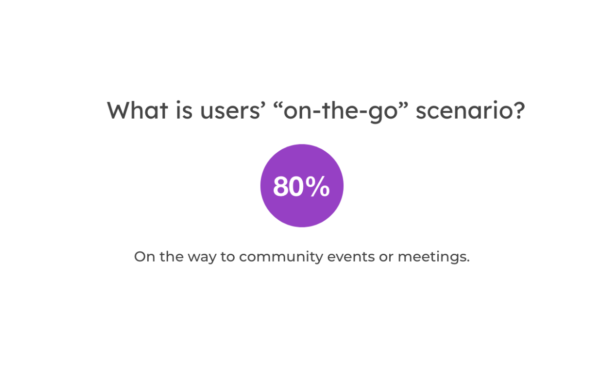
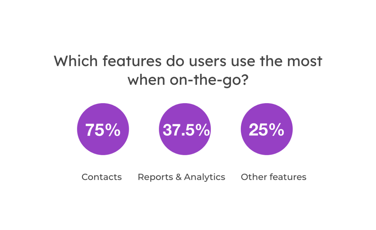
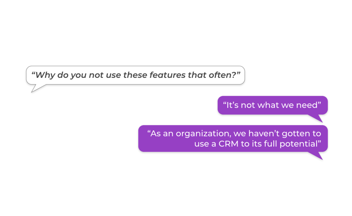
We wanted to understand how NPOs used management softwares, what features were important to them, and what were the on-the-go scenarios. Therefore, we interviewed and sent out surveys to people working in NPOs.
The images on the right and below answered the question “How NPOs used management softwares?”
INSIGHTS FROM RESEARCH
Different needs: Different NPOs had various needs on management software due to the sizes of organizations, the scope of the business, and the maturity of using technology on management.
Contact management: It was an essential feature for users mostly needed to check and updated contact information during on-the-go situations.
Impact evaluation: This feature could better engage donors with future fundraising campaigns by showing the impacts they contributed.
Team progress & delegation: Being transparent on team activities was a feature nice-to-have, as NPOs had lots of tasks and campaigns running.
CRMs hard to implement: Any software system or customer relationship management tool was hard to implement to all nonprofits, for most NPOs had no budget or limited experience in using the software system.
PROCESS TWO: PLANNING THE MOBILE APP
MOVING FORWARD —
Structure user experience
We outlined the user journey, putting ourselves in users’ shoes. Then we could know user pain points and see the opportunities for solutions.
VISUALIZING USER EXPERIENCE - USER SCENARIO
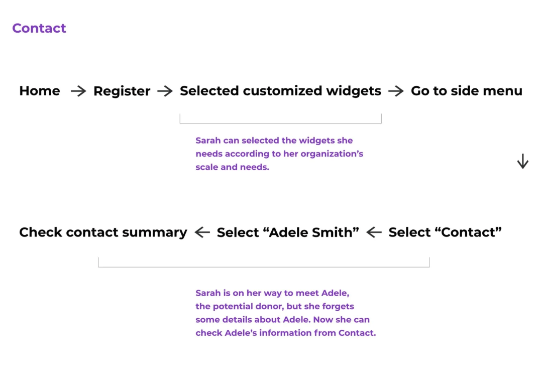
Below was the hypothesized user scenario on using KEELA mobile app on-the-go. Sarah was the new CRM manager after Deborah retired from the position. Her first task was to meet Adele, a significant donor, to build rapport as well as asking Adele to donate to the upcoming campaign. The main features Sarah used in the mobile app were:
1)Contact: Sarah checked Adele’s profile for a better understanding before meeting this vital donor.
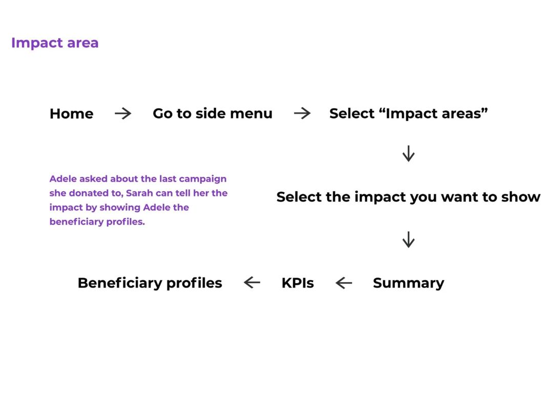
2)Impact areas: Sarah showed Adele the beneficiary profiles, as Adele wondered her previous contribution.
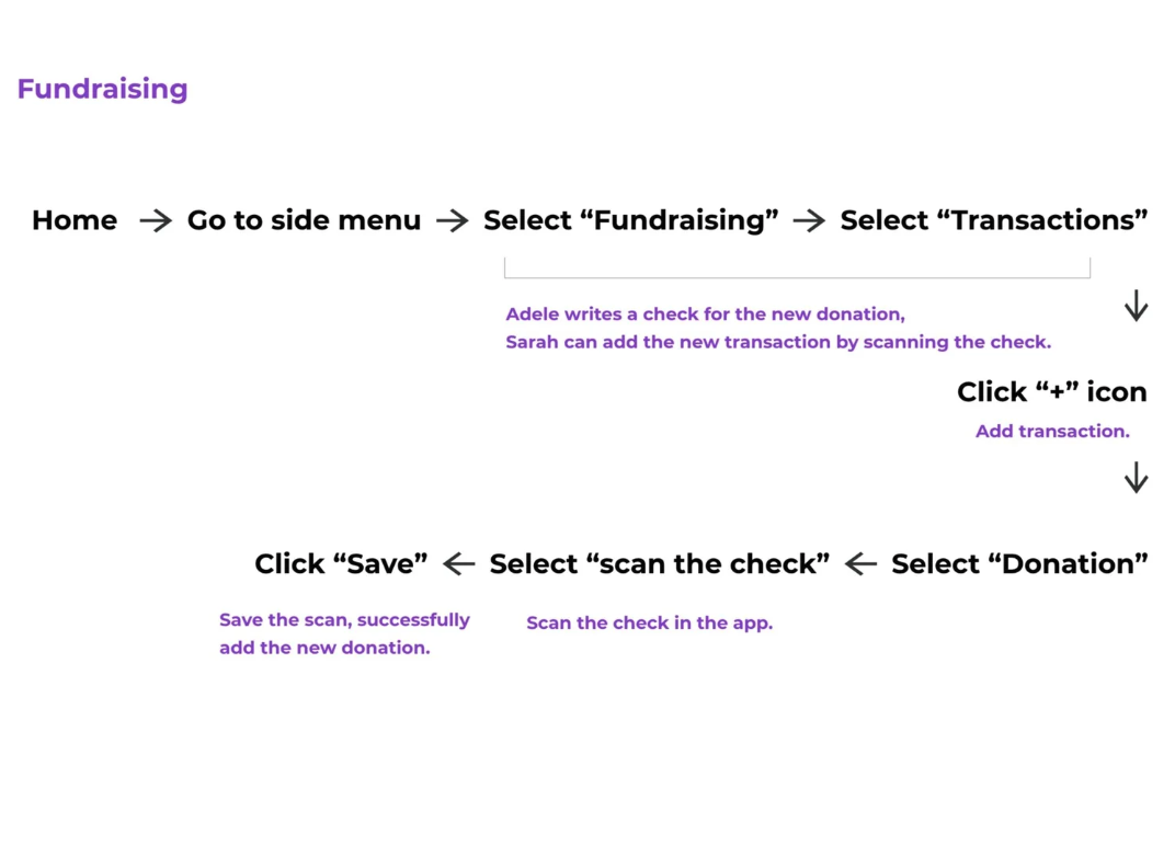
3)Fundraising: Adele made the donation right away with a cheque. Sarah scanned it and uploaded it to the system.

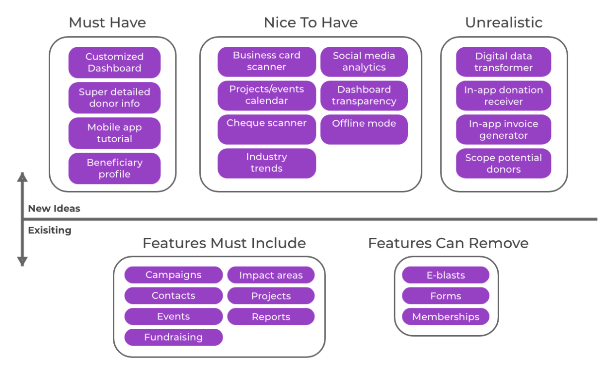
MAXIMIZE USER PRODUCTIVITY - FEATURE ELIMINATION & SUPPLEMENTATION
Our goal for the project was to assist operational efficiency for on-the-go users. Therefore, we removed tasks that users would prefer to perform on computers rather than mobile phones. In addition, we supplemented functions which on-the-go users would find it handy.
Removed e-blasts, memberships, and forms. The work behind those features needed plenty of typing, formatting, and viewing, so we hypothesized that users better conducted with laptop.
Limited capabilities of creation and edit. Users could only “view” the content of reports, campaigns and projects.
Added functions benefiting on-the-go tasks. Users could scan business cards adding to contact information, scanning cheques to fundraising activities. We added beneficiary profiles in impact area to better engage potential donors. We also created a calendar in events for quickly tracking schedules.
BEFORE WIREFRAMES - USER FLOWS
Sketching out the user flows helped us develop the wireframes for each feature. Below showed three user flows matching up with Sarah’s scenario.
INSIGHTS FROM PLANNING
Customization. We created the flexibility for users to select widgets to their dashboards based on the needs of the organization.
Elimination. We removed features that users mainly worked on computers instead of mobile phones. We also made certain areas into read-only to maximize the efficiency on-the-go.
Personas are our primary users. We worked with laser focus on our target users. The personas were removed from this study due to the confidentiality agreement.
Removed the new idea of social media engagement. We had an idea of having a social media engagement tracker inside the app. It could show the report of hits and reach from social media.(e.g., Facebook, Twitter, and Instagram) However, we abandoned the idea due to time concern and the marketing tendency of this feature.
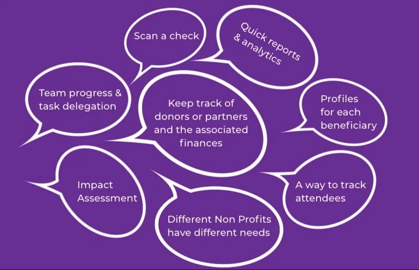
SELECTING FEATURES - AFFINITY DIAGRAM
The chart on the right showed the necessity of features from research results. We selected few essential features to incorporate in our user scenario.

DIVE IN USER’S FEELINGS & PAIN POINTS - USER JOURNEY MAP
We analyzed Sarah’s journey in a user-centric way. Diving in each stage, we collected pain points from each action and the attached emotions. It presented the pivot of our design solutions.

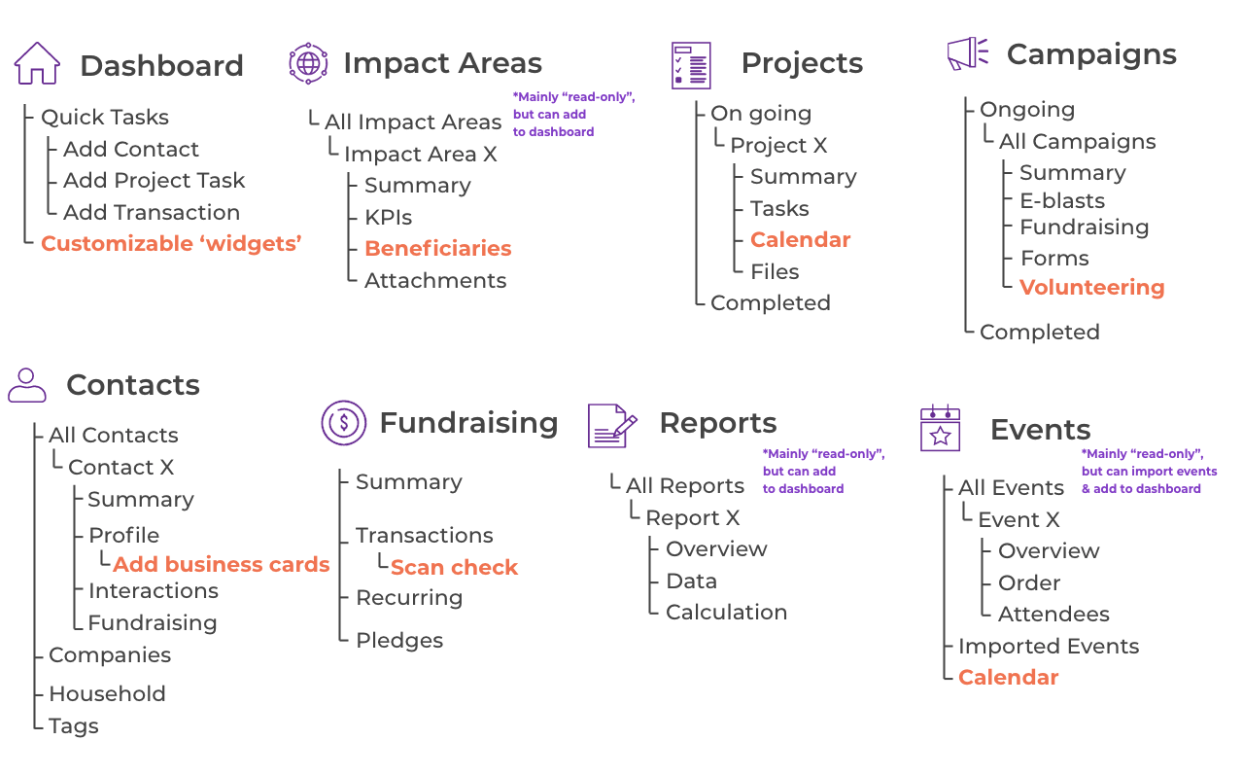
FRAMING THE SKELETON - INFORMATION ARCHITECTURE
This was the structure for KEELA mobile app after the process of elimination and supplementation. The orange marks were new features added by us. Information architecture was the foundation of all wireframes and navigation in the app. I was responsible for designing wireframes of impact areas, reports and events.
PROCESS THREE: WIREFRAMING & TESTING
THE WORK INSIDE AND OUT —
Visualize the app
This stage included plenty of wireframes iteration and user testing. After a few testing, we mainly adjusted the interface for the sake of usability, while the whole structure remained unchanged.

LOW&MID-FIDELITY WIREFRAMES
We started by sketching the menu page together, deciding the standard interface through the app. For example, the bottom navigation bar, the location of the sidebar menu, and the listing of features. Then we continued to work on separate features. We found that breaking down the user flows of each task first could help provide us with a clear understanding on the page hierarchy in each feature.

USABILITY TESTING & ITERATION
We conducted testing with 6 users with 9 tasks from all features. All tasks were completed successfully by all users; however, users were comparatively slower on completing tasks under projects, fundraising and contacts. We made revisions to address the problems causing slow completion.
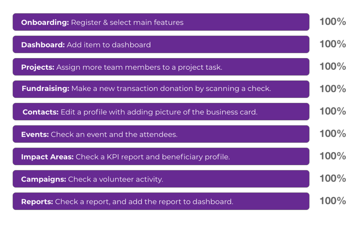
Feature, task, and general completion rate
1) Users had a hard time finding “Task” in project, because its original name “List” was confusing.

3) Users were confused between “Summary” and “Profile”, so we changed the content layout with a more prominent differentiation. Plus, we added the “Send email” button for KEELA’s need.
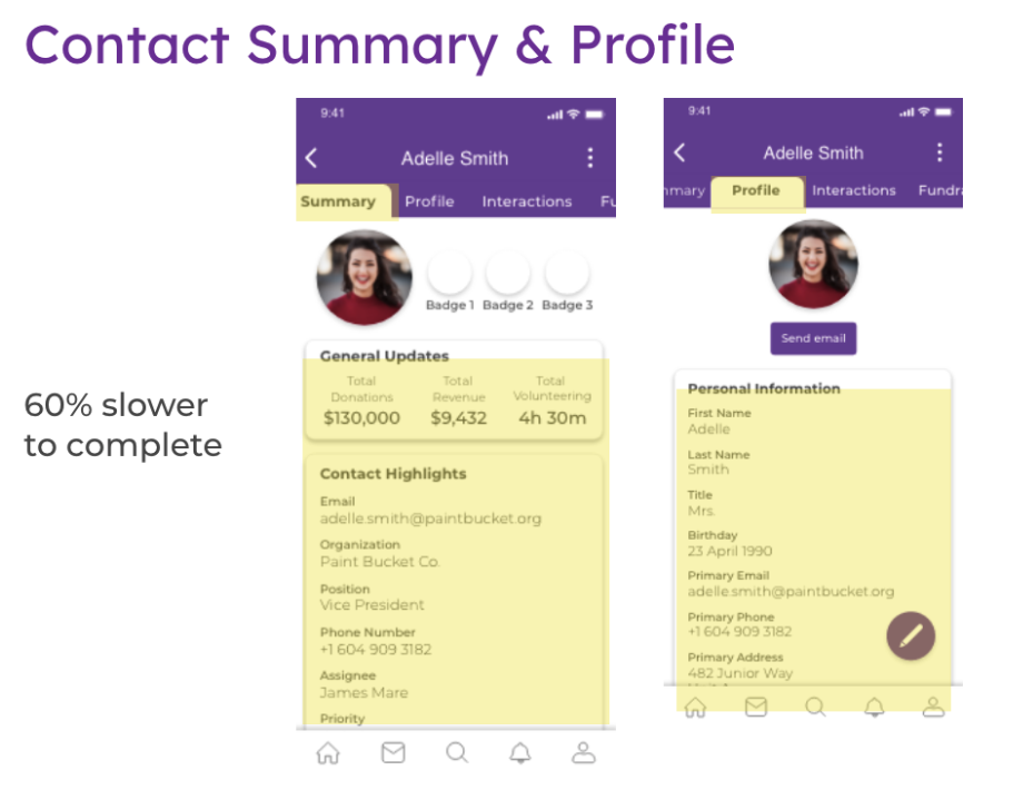
4) The “Edit” button wasn’t easy to find. It used to be inside the vertical dots icon at the top left, so we created the editing pencil at the button right corner to make it more intuitive for users.

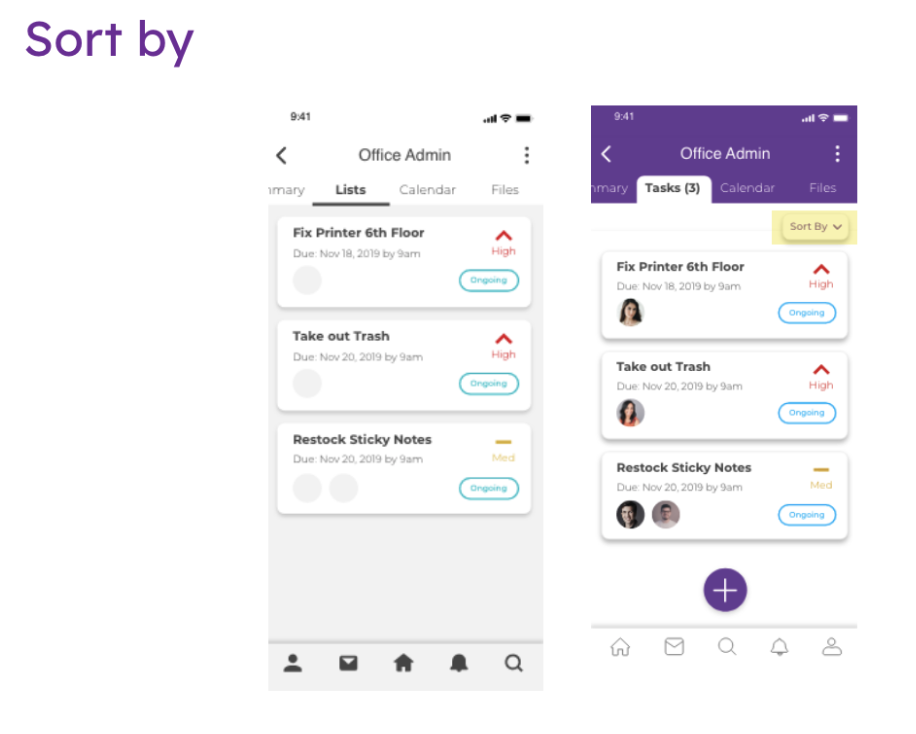
6) A “sort by” button would come in handy when looking for information in a massive amount of data.
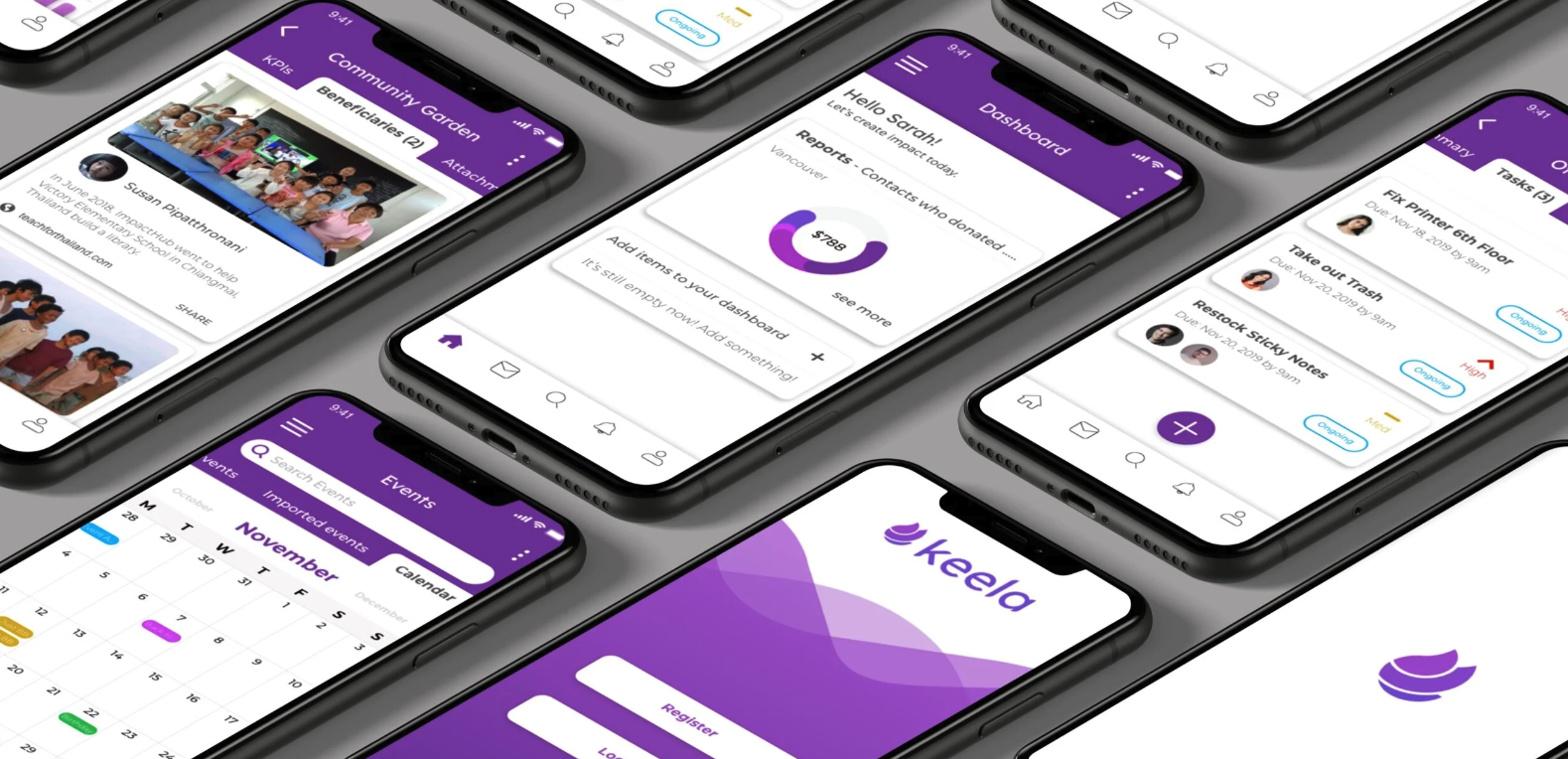
FINAL PROTOTYPES
Our UI team started working on style guide when UX team was designing wireframes. The below prototypes showed the high-fidelity wireframes after UI team put “clothes” on our design.
LOW&MID-FIDELITY WIREFRAMES
We started by sketching the menu page together, deciding the standard interface through the app. For example, the bottom navigation bar, the location of the sidebar menu, and the listing of features. Then we continued to work on separate features. We found that breaking down the user flows of each task first could help provide us with a clear understanding on the page hierarchy in each feature.

FIRST REVISION BEFORE TESTING
We found the way we listed down the events couldn’t cover more than 20 letters. If the event is “Fundraising dinner for Haiti”, the display would show as “Fundraising dinner for… “. It strongly affected readability and caused distraction. We replaced it with the “bubble container”, which sorted each even into independent bubbles, solving the problems of cutting out the texts.

Task completion rate with time consuming factor
2) Users were confused about how to scan the check, so we renamed the button into more specifically “Scan Check“.


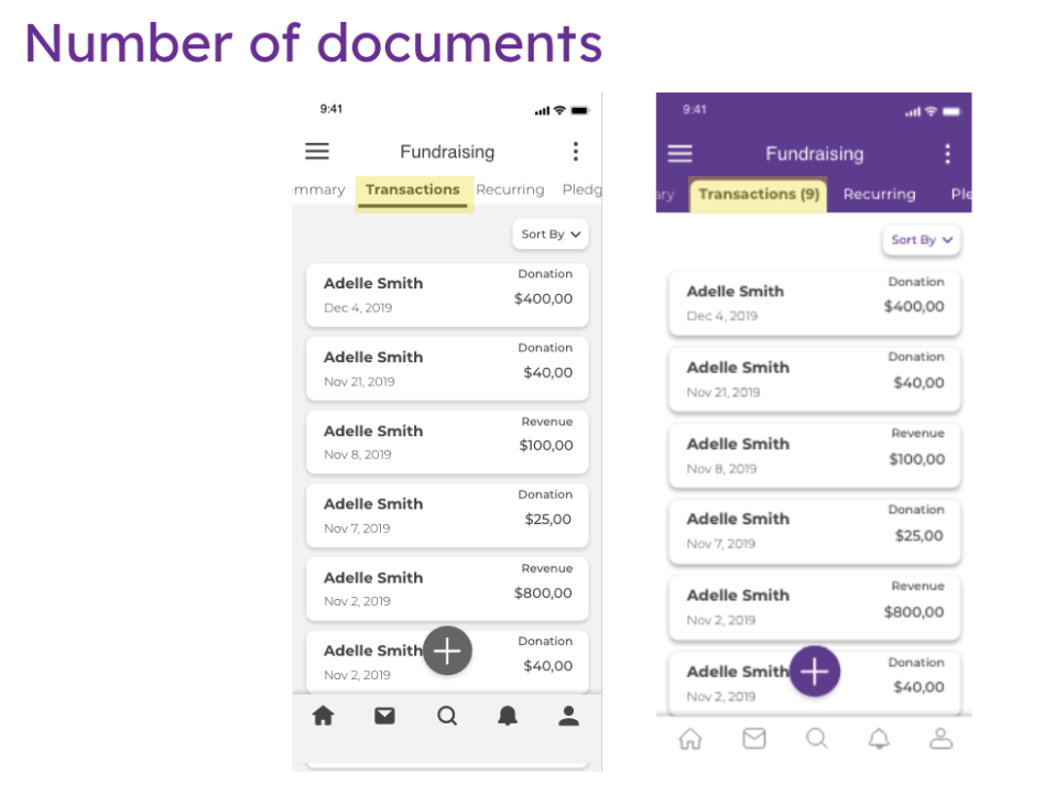
5) Users suggested having the number of data showing beside each tag for better expecting the amount of information(how long they should scroll).
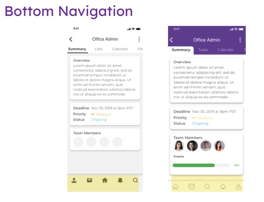
7) Users offered feedback on having the home button to the left instead of in the middle. We did the AB testing with more users and referred to how Instagram, Spotify, Facebook, and Reddit arrange the bottom menu. We decided to move the home feature to the left.

Homepage
Contact- Edit contact with uploading business cards.
Projects- Assign team members to a certain project.
Fundraising- Add donation by scanning check.
Reports- Check reports and add to dashboard.
Impact areas- Check beneficiary profiles.
LEARNING & AFTERTHOUGHT
We faced challenges at the initial stage due to our limited understanding towards NPOs, and having only a few valid users for interviews and surveys. We decided to reach out to the community coordinator at RED Academy, asking her to connect us with NPOs she knew. We then successfully collected more useful interviews and feedbacks from the right target users.
I was grateful for KEELA’s support and helpful feedback along the way. I enjoyed the energetic dynamics working with KEELA and eventually they were very happy with the design. We were not accessible to KEELA’s further possibility of app development due to confidentiality agreement.
UX design is always about putting ourselves in users' shoes. I learned to observe users and listened to what they said, because their actions sometimes contradicted their words. I found it interesting to listen to users' mutters during testing, for some users would reveal their confusion unconsciously or showing on their facial expressions.
If I had had more time, I would like to have a more vivid and interactive design beyond the current high-fidelity prototypes.