
Brief
A brand identity, visual system, and narrative framework for a luxury fragrance startup targeting ultra-high-net-worth buyers
Industry
Luxury fragrance / Consumer goods
Scope
Brand identity from the ground up includes naming, narrative, visual system
My Role
Brand Narrative Strategist & Creative Director
Deliverables
Brand narrative strategy & positioning, visual identity, logo & typography system, packaging concept, brand narrative framework, copywriting & tone of voice
1
The situation
SHIZUKA is a high-end fragrance brand built for the ultra-high-net-worth consumer — individuals with annual incomes of $500K+ who value privacy, serenity, and radical understatement. The brief was to build a brand identity from the ground up: name, positioning, visual system, and the story underneath all of it.
The surface ask was design. But design for a luxury brand without a clear philosophical foundation (aka the right story) is just aesthetics — and aesthetics without meaning don't command premium prices. So I started somewhere else.
2
The real problem
The high-end fragrance market is dominated by "statement" scents — heavy, diffusive, designed to impose. That's the implicit story the entire category tells: wear this and be noticed.
But for the audience SHIZUKA was being built for, that story is precisely the wrong one. People at this level of wealth and influence are already noticed. Their actual desire is the opposite: control over their atmosphere. Quiet. Presence without imposition.
The brand problem wasn't visual. It was conceptual. SHIZUKA needed to reject the category story entirely and build a new one — not around "perfume" at all, but around something closer to architecture. You don't wear SHIZUKA. You inhabit it.
3
The process
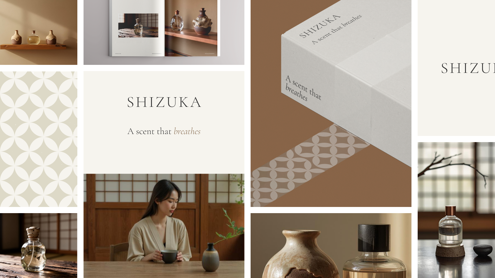
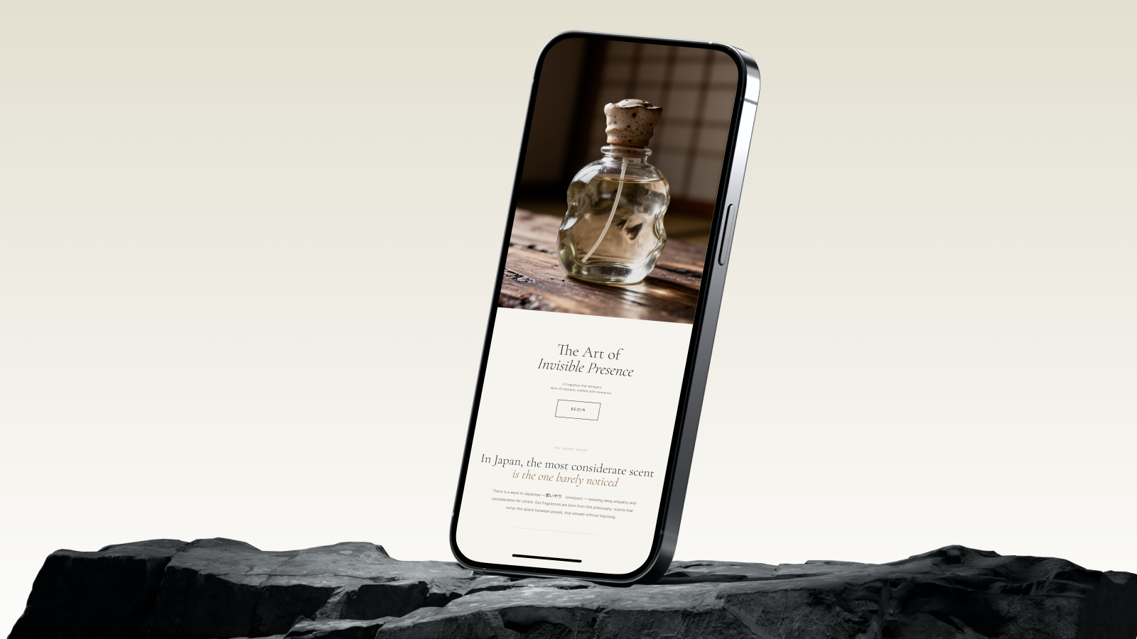
The first decision was philosophical: which framework would hold the brand together? I looked to the Japanese concept of Omoiyari (思いやり) — deep empathy and consideration for others — as the North Star. In Japanese culture, the most considerate scent is the one barely noticed. It elevates the space between people rather than demanding to bridge it.
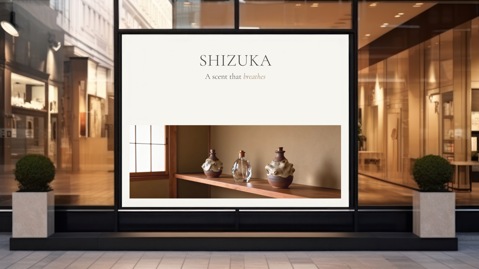
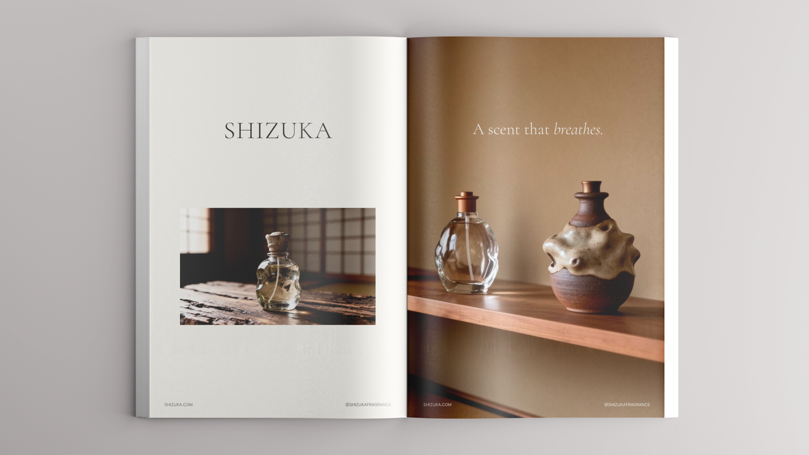
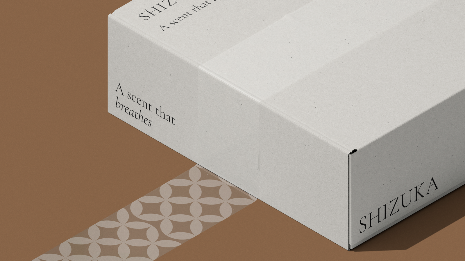
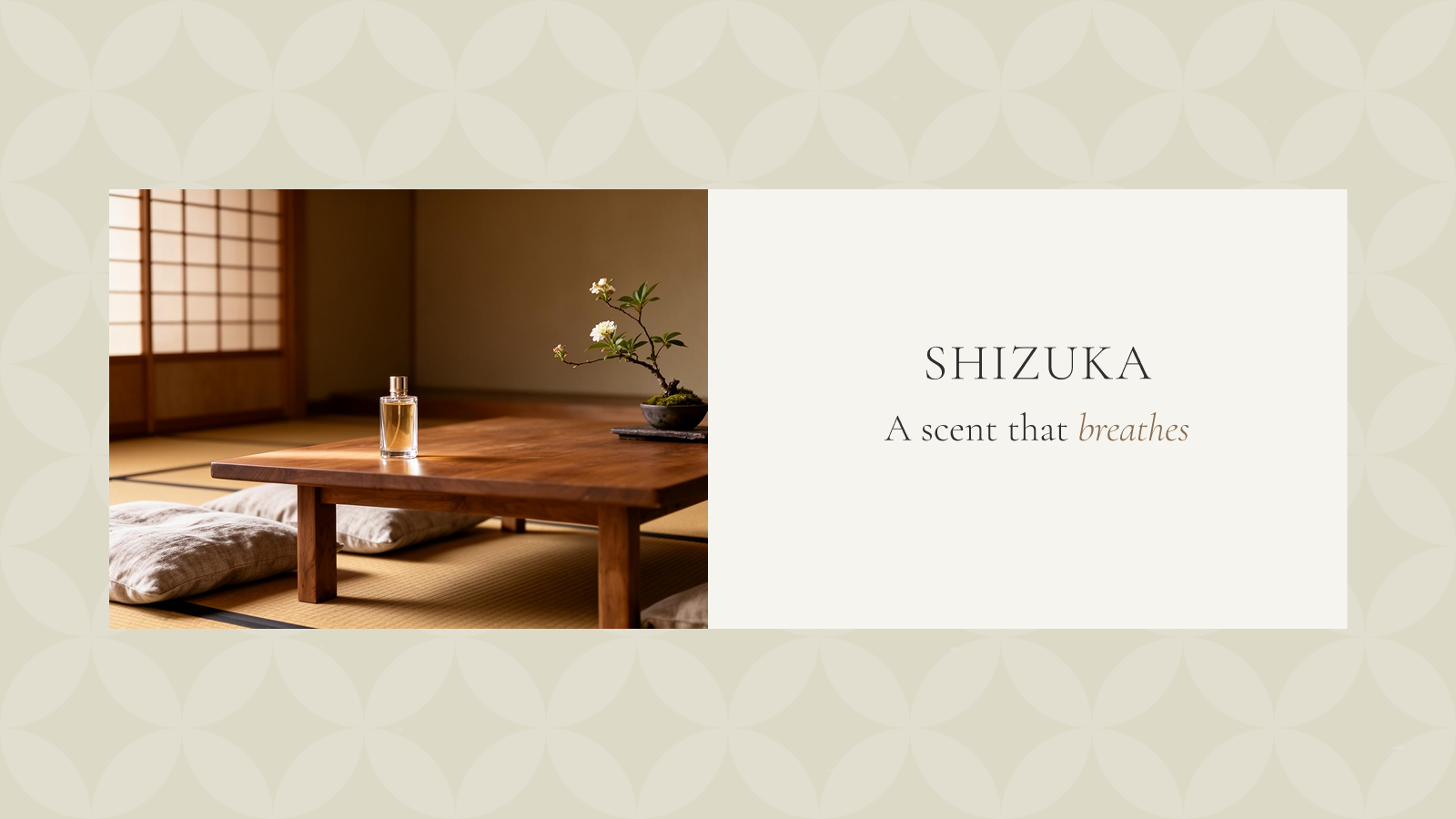
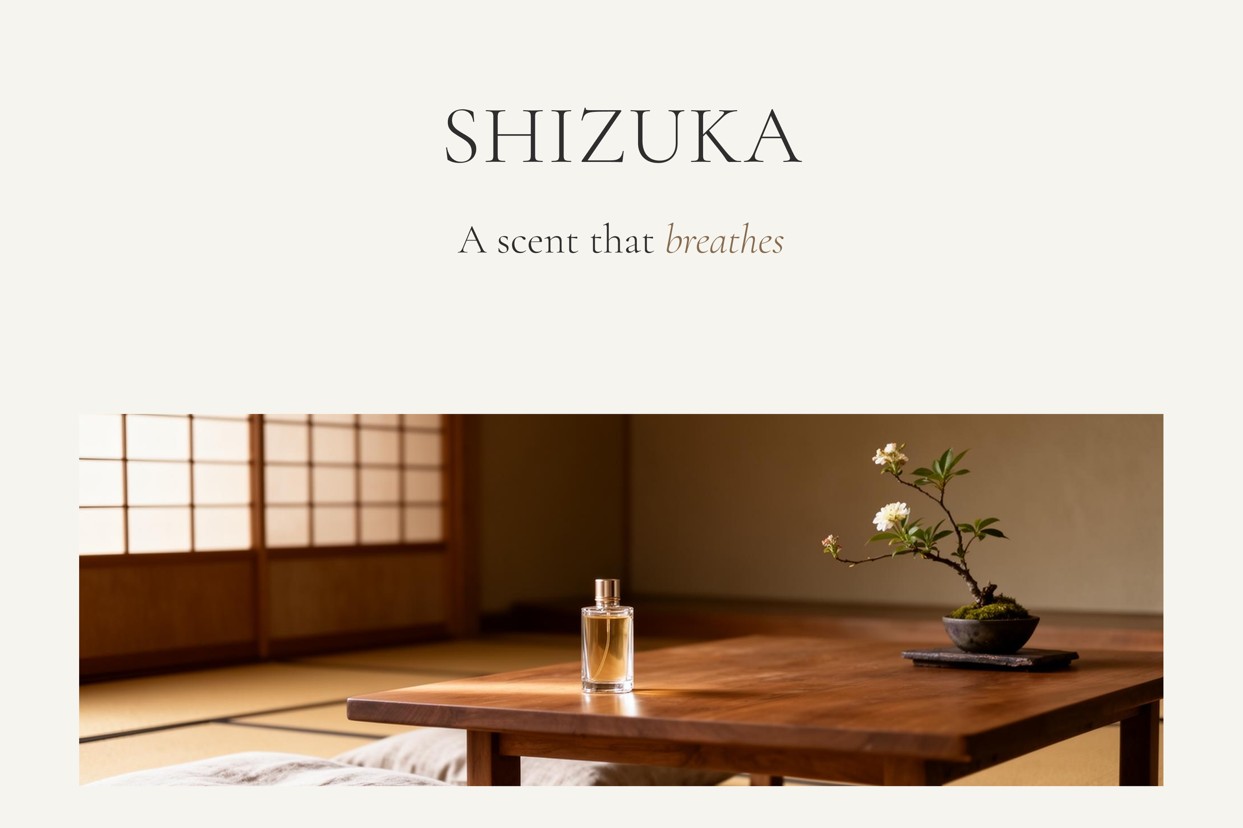
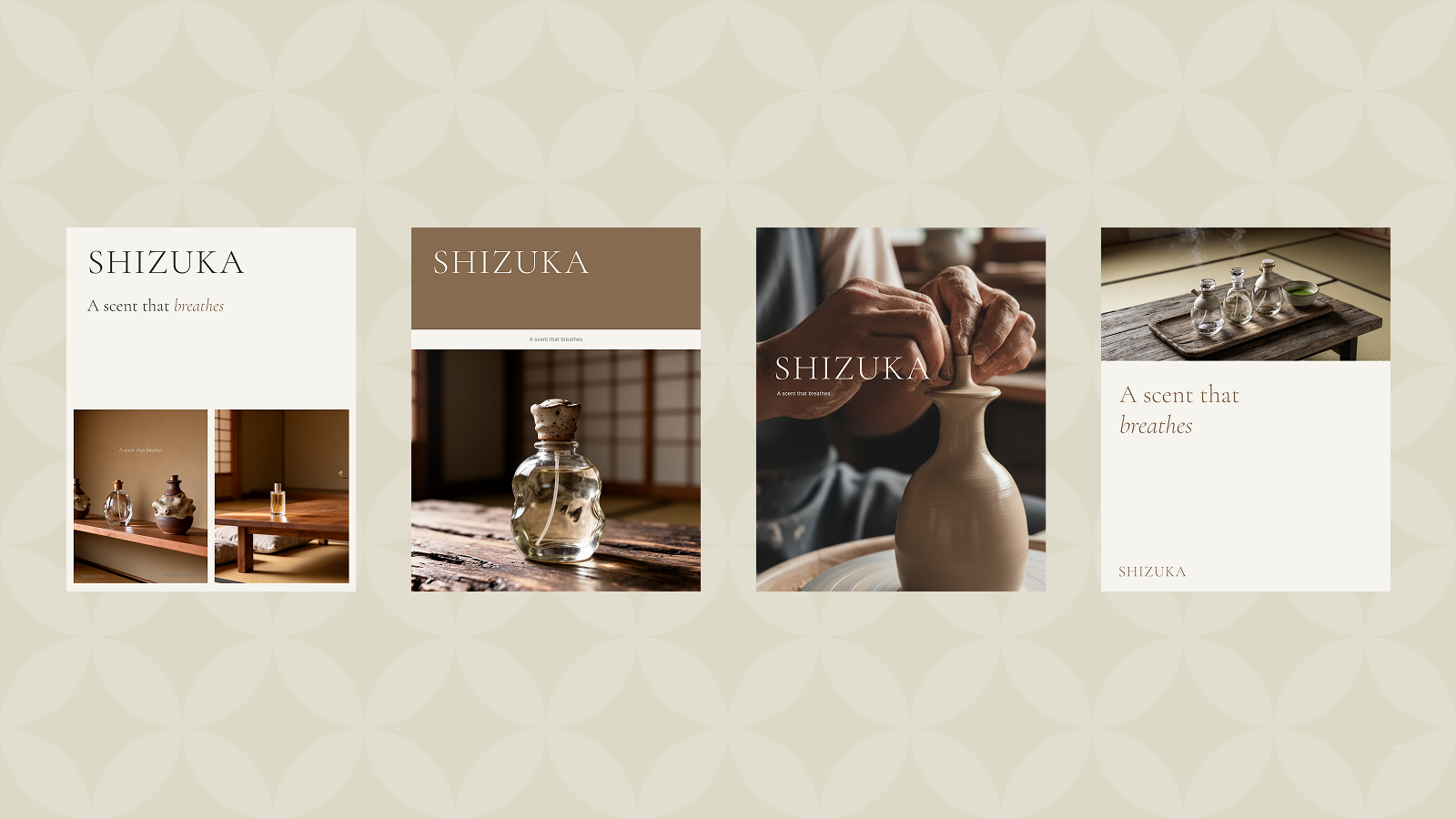
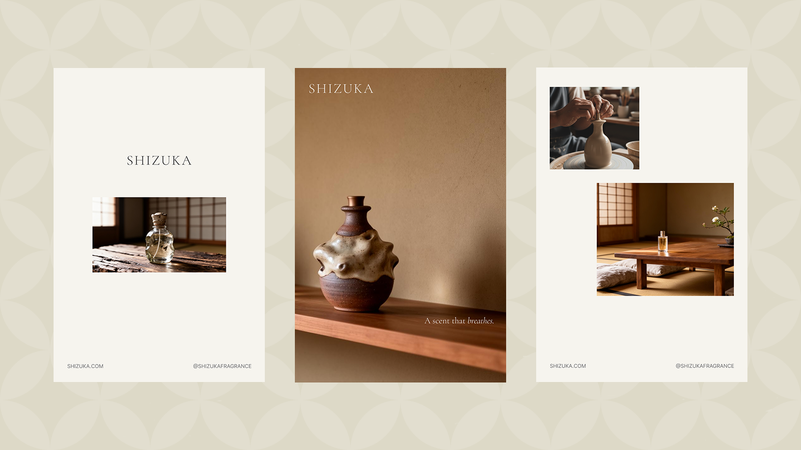
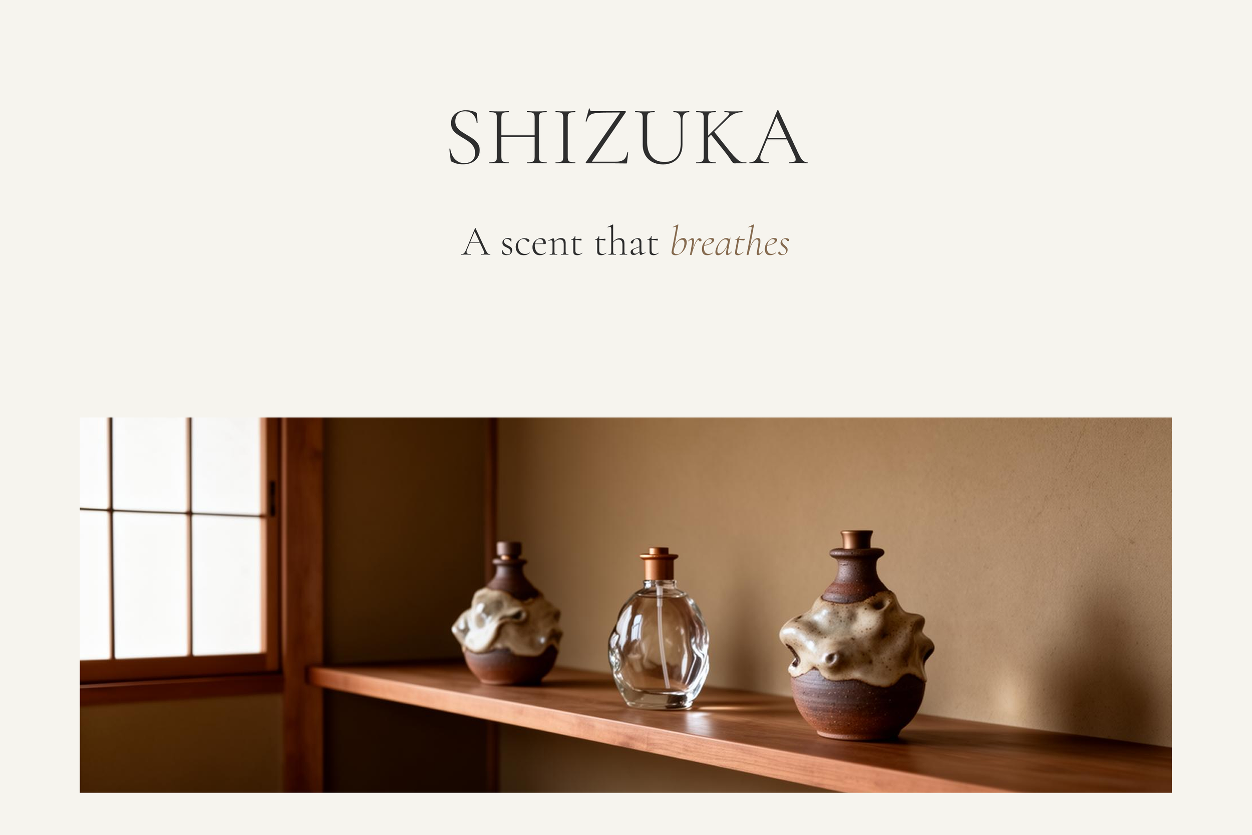
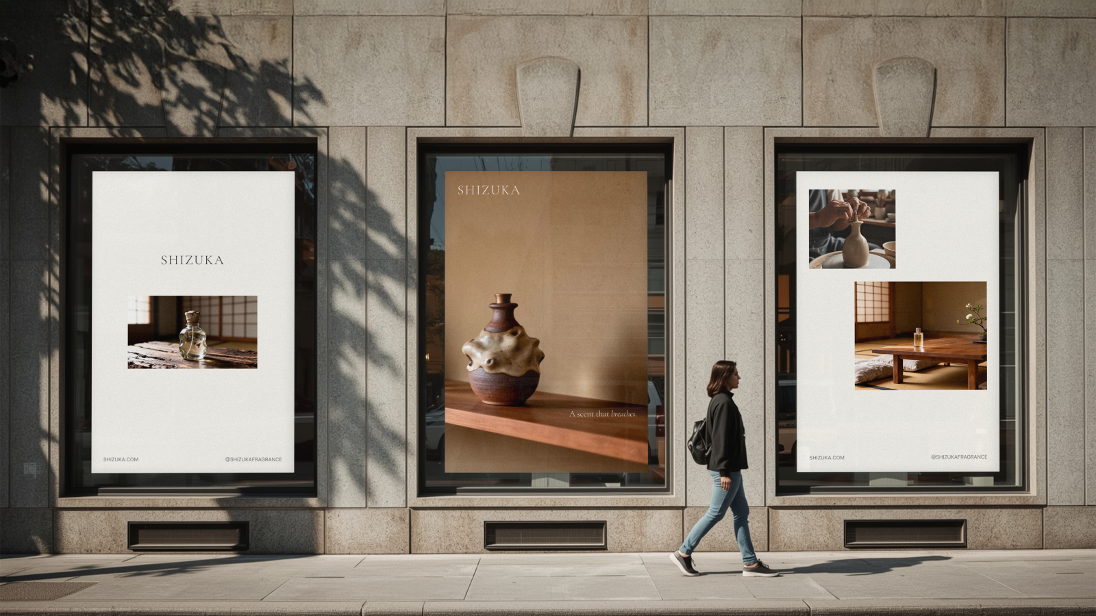
From that single idea, everything else followed. The creative direction became: "The scent that breathes." Not a product you apply — an atmosphere you create. The language of the brand shifted from sensory description (notes, diffusion, longevity) to spatial description (room, light, architecture, air).
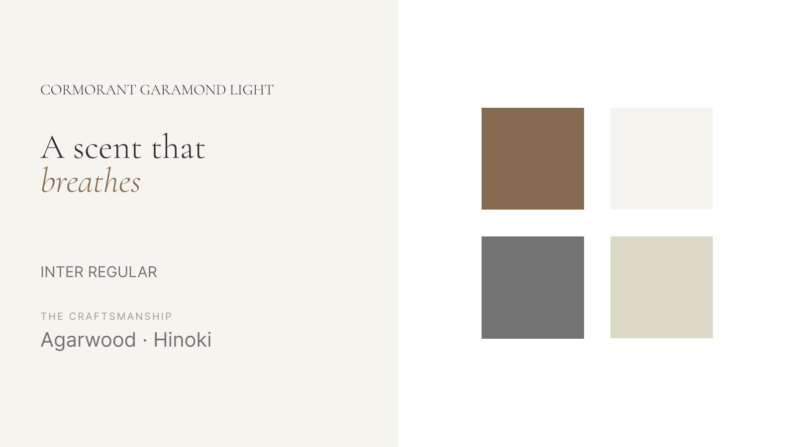
Visually, I built the identity around material harmony — the union of hand-blown glass and kiln-fired pottery. This tension (clarity and earthiness, translucence and weight) mirrors the brand's core idea: a fragrance that is both invisible and unmistakably present. The typography — a single serif mark, nothing more — was an exercise in restraint that became a statement in itself. The logo doesn't appear on the bottles. That decision alone communicates everything about who SHIZUKA is for.
4
A detail worth noting
Each fragrance in the SHIZUKA line is accompanied by a unique haiku written by the founder. This wasn't a decorative choice — it was a strategic one. It shifts the product from commodity (a luxury perfume) to cultural artefact (a fragrance with a literary identity). It gives the brand a reason to exist beyond the scent itself, and it gives the buyer something to carry: a small piece of language that belongs only to that bottle.
Story, in other words, embedded directly into the product.
5
The outcome
SHIZUKA launched with a coherent identity that operates on three levels simultaneously: the visual (restrained, material, architectural), the philosophical (Omoiyari, polite distance, invisible presence), and the literary (haiku, language as product). Each level reinforces the others.
The brand doesn't compete in the high-end fragrance market. It redefines what that market means for a specific audience — and in doing so, removes itself from direct competition entirely. That's what a clear narrative does.
Note: Self-initiated concept project