Brief
A full website redesign for a SaaS platform expanding into a new market
Industry
Field service SaaS
Scope
34 pages + mobile
My Role
Sole designer
Deliverables
Website design, dev handoff
Collaboration
Kollectively
1
The situation
Yeti Software is a SaaS platform built for snow removal operators, now expanding into lawn care. They came to me with a familiar request: the website feels outdated, and it needs a refresh. Thirty-four pages, two service lines, one clear directive — modernise.
2
The real problem
The surface request was visual. But the real issue was credibility. Yeti's product was genuinely sophisticated — and their site was telling a different story. Generic stock photography made them look like every other field-services brand.
What they thought was a visual problem was actually a representation problem — the site couldn't explain what the software actually did, so it defaulted to images of people in hard hats instead.
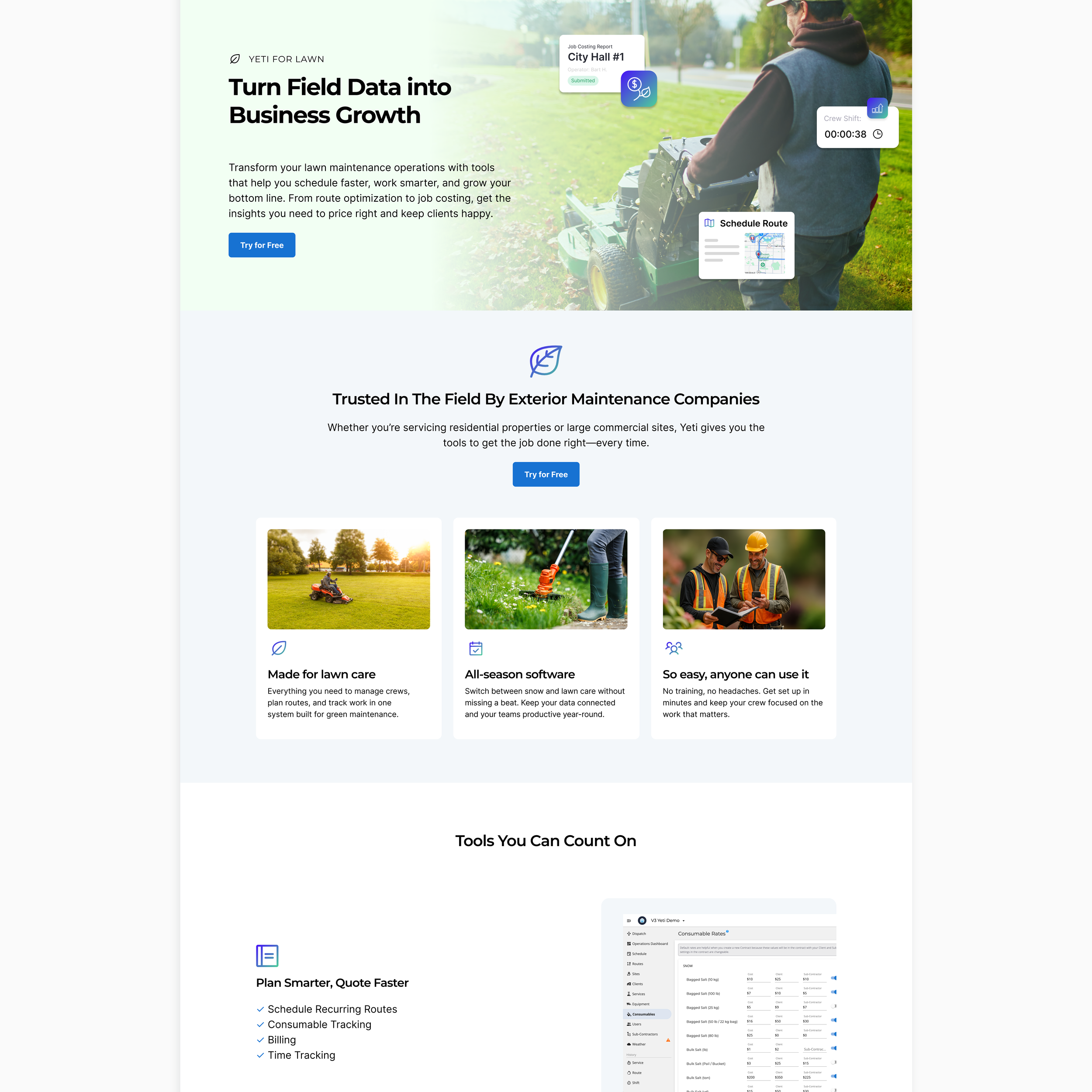
The expansion into lawn care compounded this. It had no visual home — it was bolted onto a site built around a single identity. The brand had evolved but it was not telling everyone about it.
3
The process
Before opening Figma, I spent time understanding the product itself. What does Yeti's software actually do — and how does it make life easier for an operator running a crew in the middle of a snowstorm? That question changed the design direction entirely.
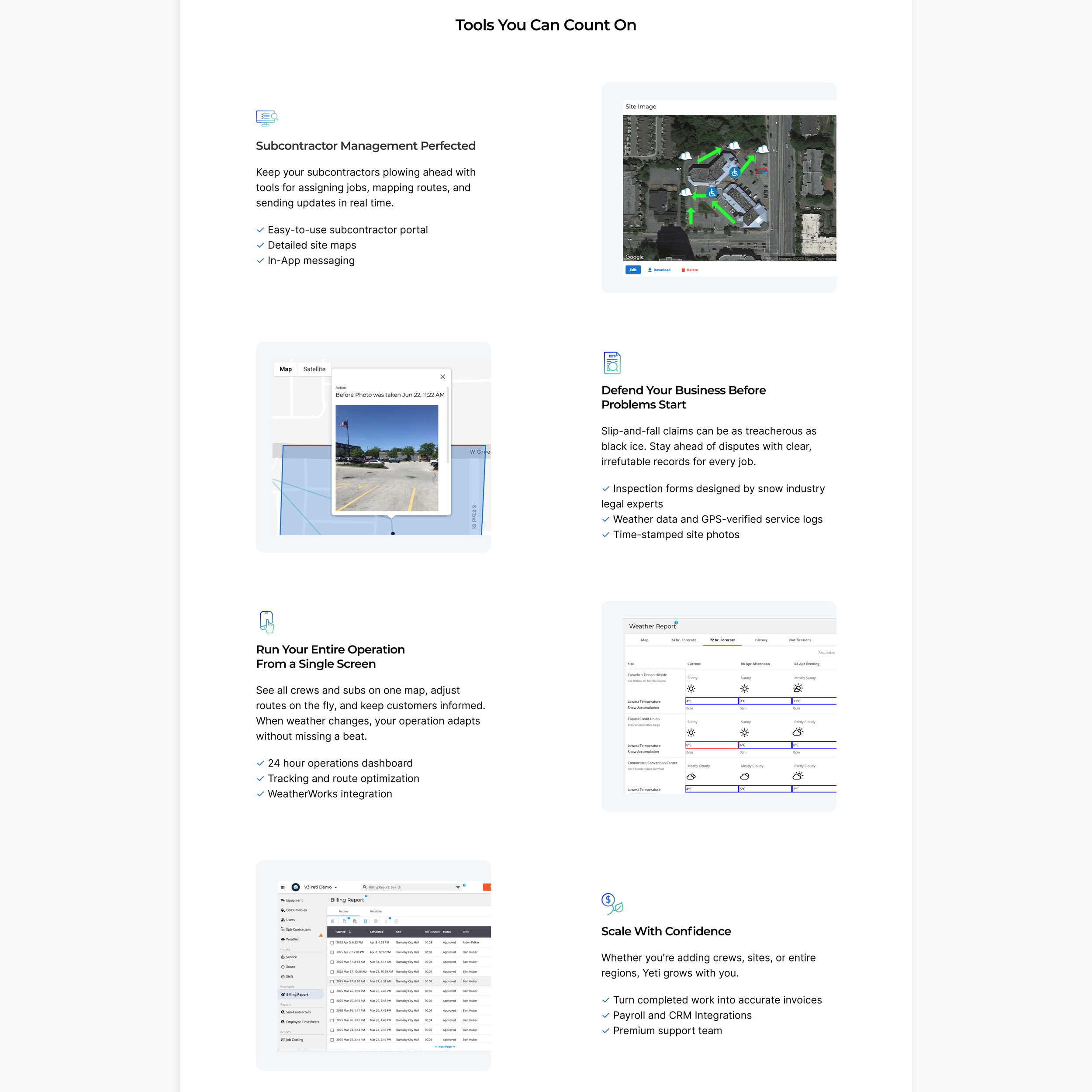
Rather than sourcing more stock photos, I advocated for something harder but more honest: show the real UI. Conceptual UI graphics and actual app screenshots became the primary visual language. From there, I mapped a full site architecture across all 34 pages, built a visual system that could stretch across both service lines without feeling fractured, and collaborated closely with the dev team throughout to make sure every decision translated into the build.
4
The work
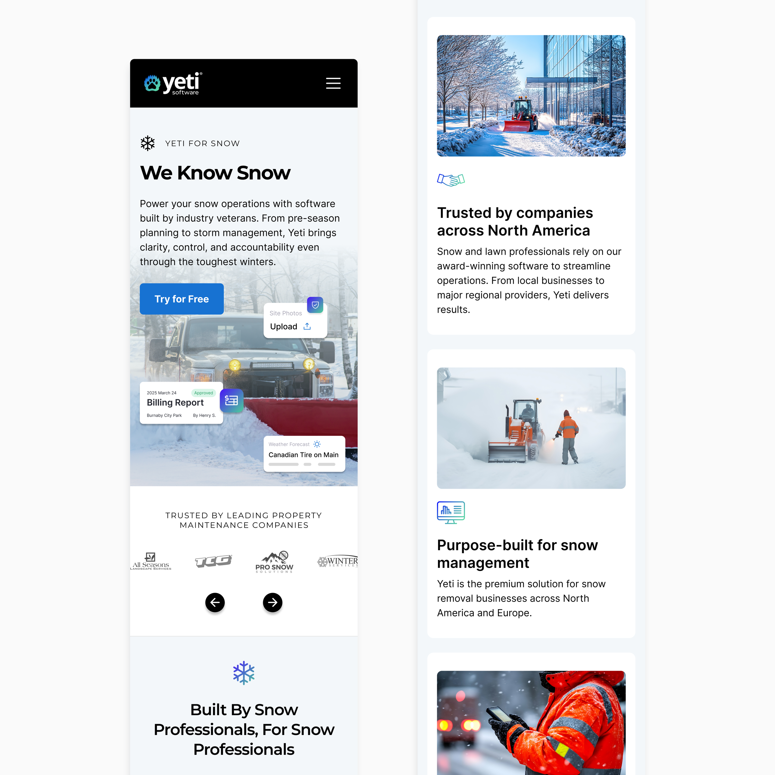
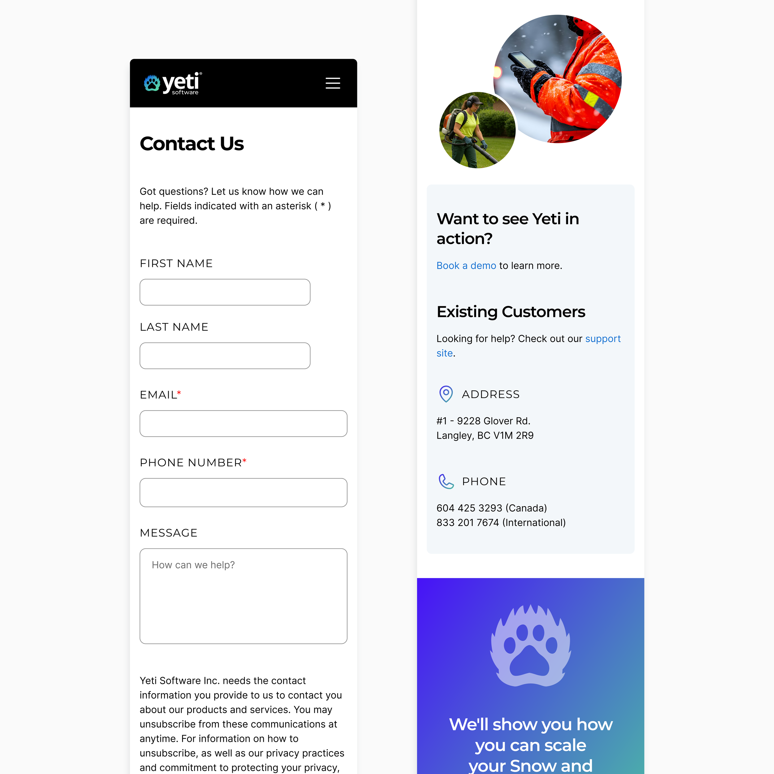
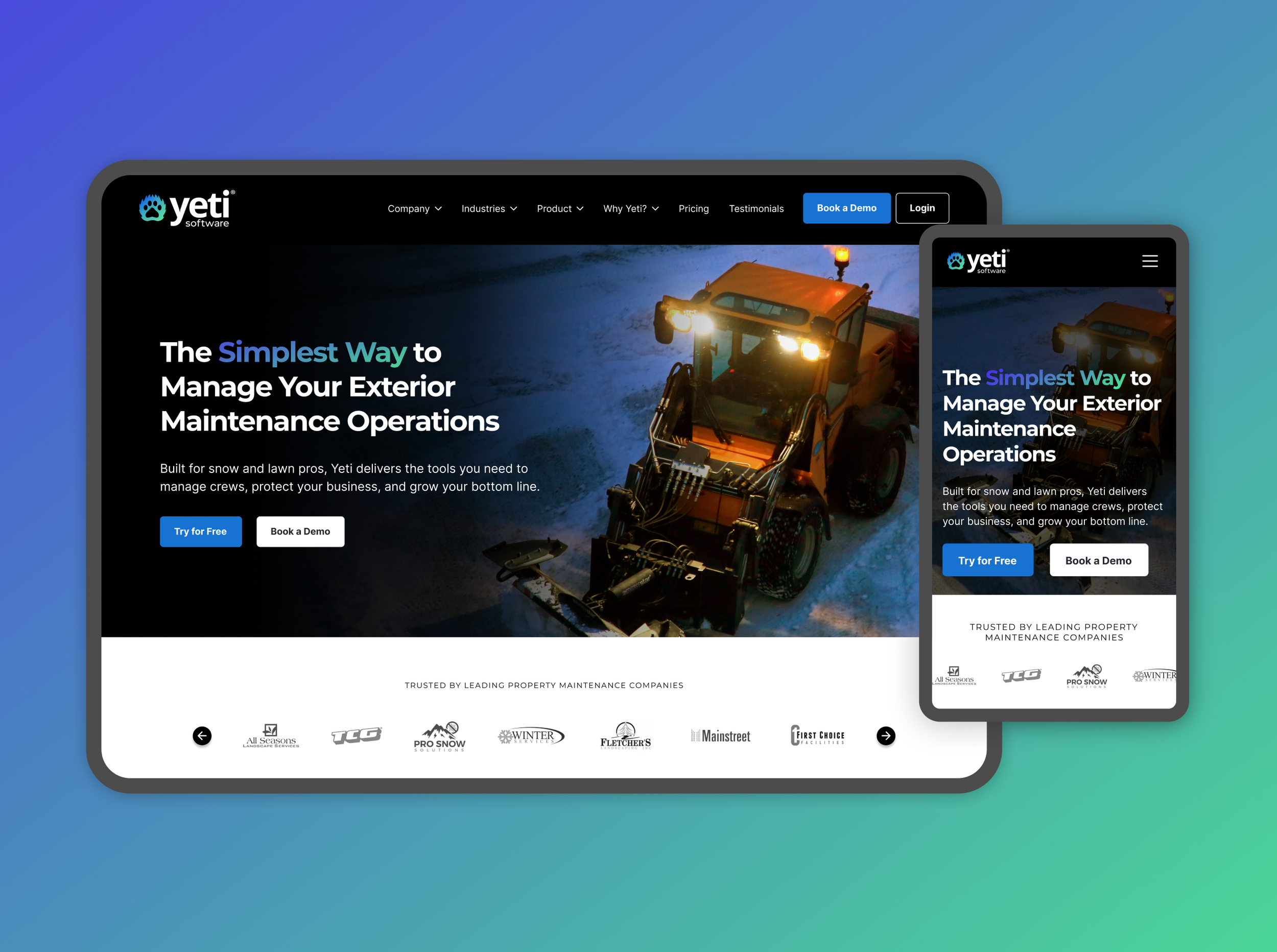
The hero needed to hold the weight of two audiences at once — snow and lawn. The visual hierarchy was designed so either operator could self-identify within seconds.
The homepage had to do double duty: introduce the brand and communicate two distinct service offerings without making either feel like an afterthought. Every section had to earn its place.

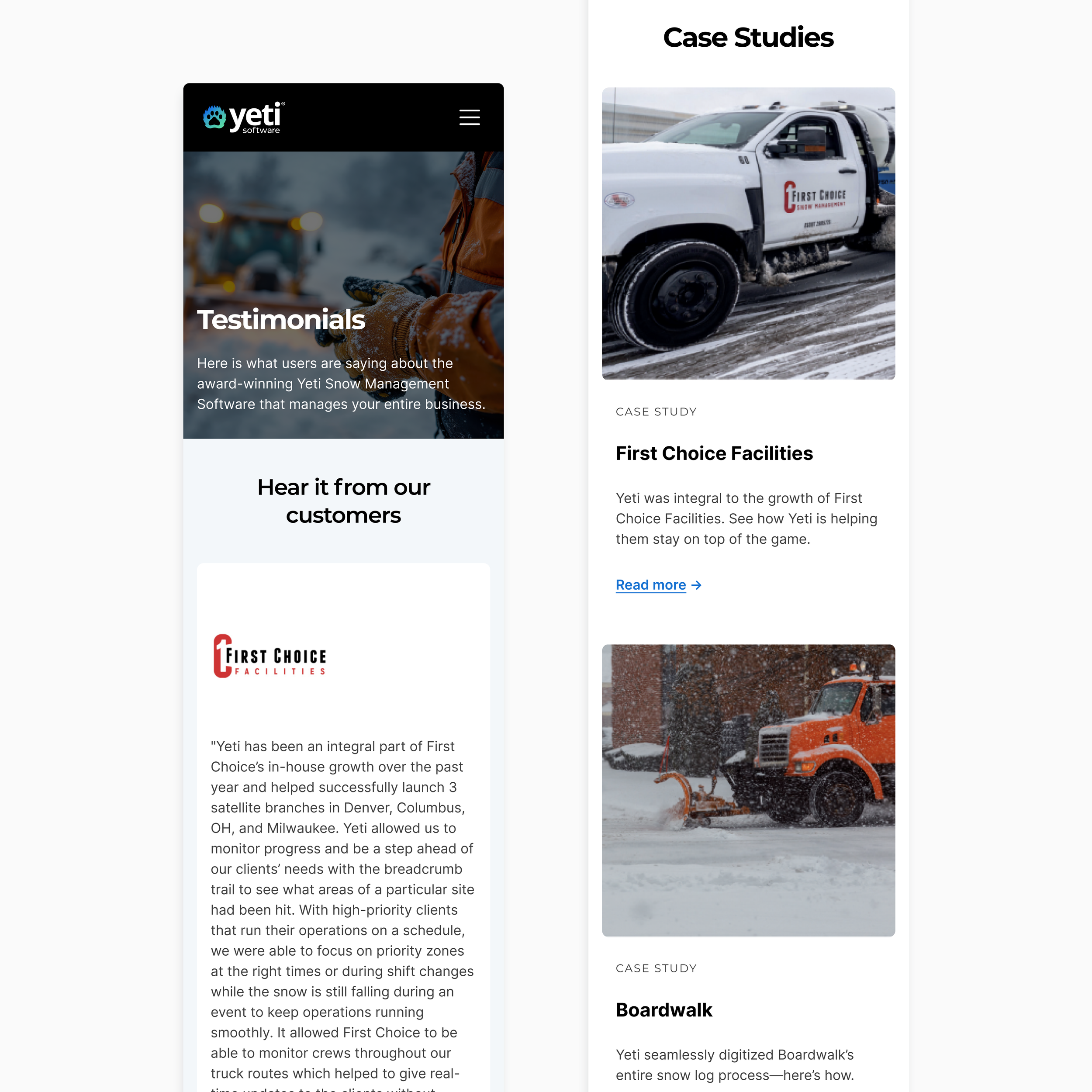
Replacing stock photography with conceptual UI snippets was the single biggest credibility shift. Suddenly the software was the hero, not the stock image.

The navigation was rebuilt around product depth — tabbed sections and structured feature pages gave visitors a clear path through complex tooling without overwhelming them on arrival.

Replacing All 34 pages were designed for mobile. The same clarity that drives the desktop experience holds at every screen size.

5
The outcome
Yeti now has a site that moves at the same pace as their product. The software is the hero. Prospective customers can navigate a complex feature set without getting lost, and the brand reads as a serious SaaS company — not a regional vendor who got a website.
For a company mid-expansion, that credibility gap was the thing that needed closing. The new site closes it.
My contributions:
Competitive research, Site architecture, Full UI design (34 pages), Mobile design, Conceptual UI graphics, Dev collaboration & handoff, Visual direction guidance
Scroll down to see more page design