Brief
A brand identity for a chocolate company built entirely around a single emotional idea: that the experience of eating good chocolate and the experience of having a crush on someone feel, neurologically and emotionally, almost identical.
Industry
Food & Beverage / Consumer Packaged Goods
Scope
Brand identity, naming concept, packaging design, copywriting, social media assets
My Role
Brand Designer & Creative Director
Deliverables
Brand naming concept, visual identity system, logo design, colour palette, typography, packaging design, copywriting, social media assets
1
The situation
The premium chocolate market has a story problem. Almost every brand in the space tells the same one: origin, craft, terroir. Single-source cacao. Ethical farming. The percentage on the label. These are real and important things — but they're also category conventions, which means they no longer differentiate. When everyone tells the same story, the story stops working.
The question I wanted to answer with this project: what would a chocolate brand look like if it stopped talking about where the chocolate came from, and started talking about how it makes you feel?
2
The real problem
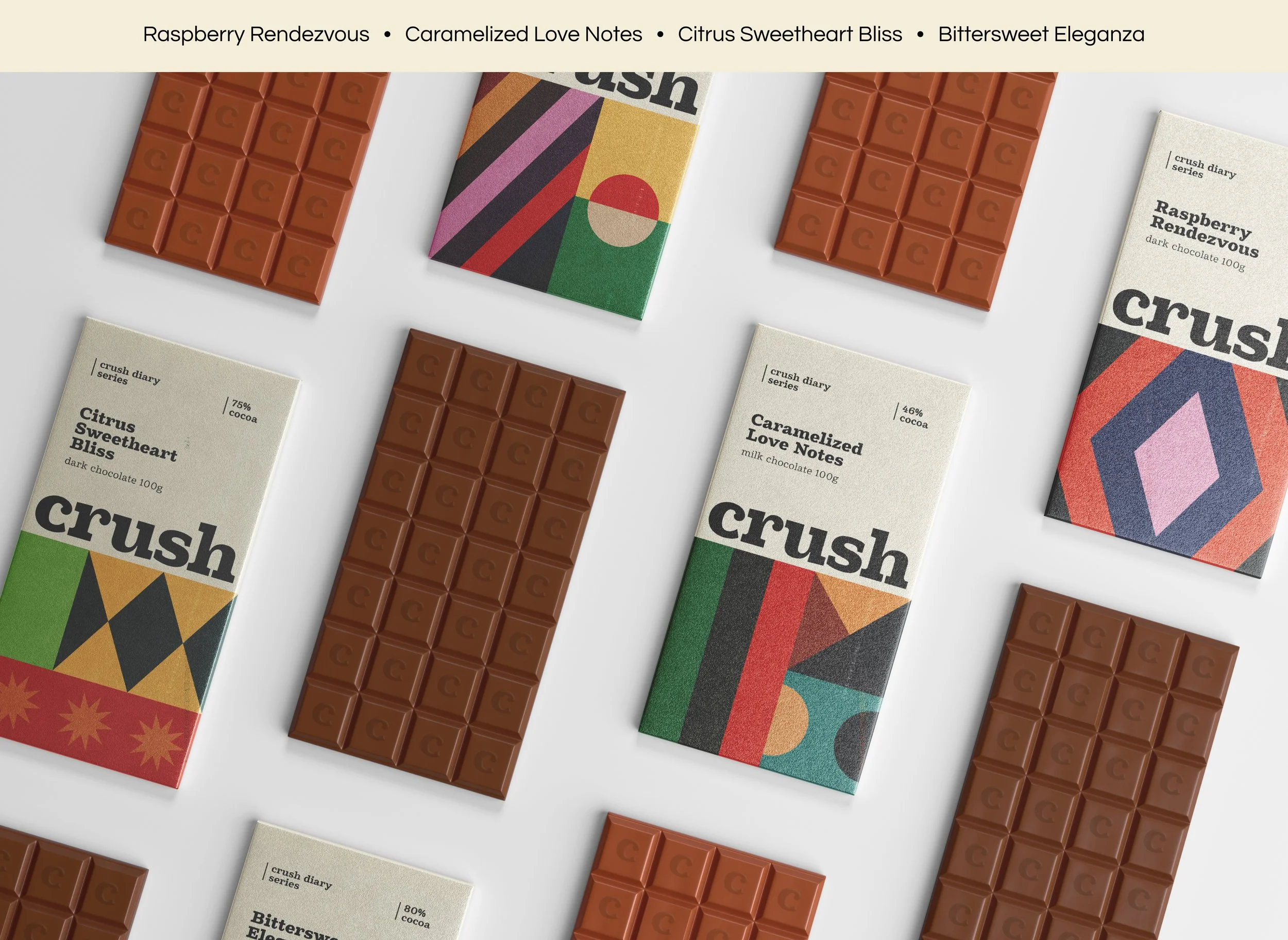
The word "crush" holds two meanings that almost never get to be in the same room. The first is agricultural: to crush is to break down, to extract, to transform raw material into something refined. The second is emotional: a crush is that specific, slightly irrational feeling of infatuation — the sweetness of it, the slight dizziness, the way it makes ordinary things feel charged.
Chocolate lives exactly at the intersection of both. The bean is crushed to make the bar. Eating the bar produces a biochemical response — dopamine, serotonin — that is measurably similar to the early stages of romantic feeling. The name wasn't a pun. It was a strategic observation: this brand could own the emotional truth of chocolate that the rest of the category was leaving on the table.
3
The process
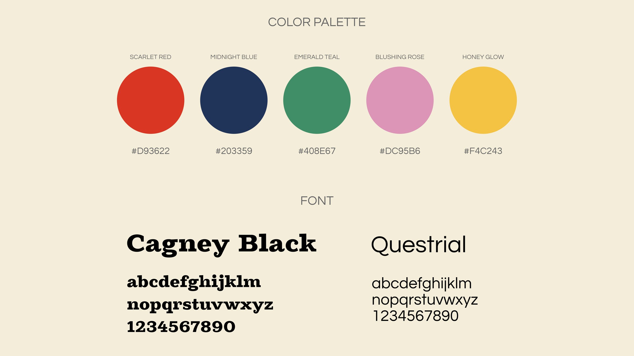
Once the naming insight was clear, every visual decision followed from a single question: what does infatuation look like?
Not love — love is deep, settled, burgundy. Infatuation is louder than that. It's the heightened colour of the world when you're in it. The slight geometric instability of a mind that can't quite think straight. The way ordinary objects seem more vivid, more present, slightly unreal.
The palette went vibrant rather than dark — a deliberate rejection of the premium chocolate convention of deep browns and blacks. The shapes went geometric and slightly restless rather than organic and grounded. The copywriting leaned into the bittersweetness of the feeling rather than the smoothness of the product: chocolate that knows the difference between sweetness and saccharine, the same way a real crush does.
The result was a brand that felt emotionally specific rather than generically premium — which in a saturated category is the more valuable position.
4
What this piece demonstrates
Crush Chocolate is a concept project, but the thinking behind it is the same thinking I bring to every brand engagement: find the emotional truth the category is ignoring, then build everything around that. The best brand names don't describe a product. They locate a feeling and make it ownable. Crush does both in five letters.
Note: Self-initiated concept project